Violet palettes and pairings
HEX
#7F00FF
RGB
127, 0, 255
HSL
270°, 100%, 50%
HSV
270°, 100%, 100%
Violet (#7F00FF) sits near the short-wavelength end of the spectrum — strongly blue-biased, high chroma, and far brighter than #800080 web purple. On RGB displays it can feel laser-like in large fills and separates cleanly from both pure blue and magenta. It is useful for sci-fi UI, music visuals, and any brief that calls for spectral intensity without full magenta punch. Next to HTML purple, violet reads cooler, more ultraviolet, and more "stage lighting" than "ink ribbon."
Best for
Trade show graphics, signage, and booth displays.
Accessibility
Violet text on white passes AA at 6.28:1, which makes it usable for headings and short labels.
How does violet compare to nearby colors?
What is the difference between violet and grape?
Grape (#6F2DA8) carries less pigment punch than Violet (#7F00FF), so the pair separates by finish as much as hue. Violet reads faster on screen, so it changes the palette from steady to attention-seeking more quickly than Grape does. Choose violet when the color needs to register quickly and act like the headline accent; keep grape when the rest of the layout needs a quieter companion.
What color is violet?
Violet as a color term historically referred to flowers (Viola species) and shorter-wavelength hues than everyday "purple." #7F00FF approximates a saturated blue-violet on sRGB monitors, though exact spectral violet cannot be fully reproduced on typical three-primary displays. High-chroma purples are common in LED stage lighting and synthetic dye chemistry.
What is the hex code for violet?
| Format | Value |
|---|---|
| HEX | #7F00FF |
| RGB | rgb(127, 0, 255) |
| HSL | hsl(270°, 100%, 50%) |
| HSV / HSB | hsv(270°, 100%, 100%) |
| CMYK (approx.) | cmyk(50%, 100%, 0%, 0%) |
Convert Violet to other color formats
Open the color converter with Violet (#7F00FF) prefilled to copy RGB, HSL, HSV, CMYK, or OKLCH values.
Convert Violet in the color converter →What does violet mean in design?
In entertainment interfaces, saturated blue-violets like violet often read as futuristic or high-energy when paired with dark backgrounds and thin geometric lines. They tend to feel less corporate than mid blues and less "sweet" than standard pinks. Against yellow or orange, violet can feel theatrical, so balance matters in brand systems.
How do I use violet in code?
| CSS (hex) | color: #7F00FF; |
| CSS (rgb) | color: rgb(127, 0, 255); |
| CSS (hsl) | color: hsl(270, 100%, 50%); |
| RGB % | rgb(50%, 0%, 100%) |
| Tailwind | text-[#7F00FF] |
| SwiftUI | Color(red: 0.498, green: 0.000, blue: 1.000) |
| UIKit | UIColor(red: 0.498, green: 0.000, blue: 1.000, alpha: 1.0) |
| Android | Color.rgb(127, 0, 255) |
| Compose | Color(0xFF7F00FF) |
| Web Safe | #6600FF |
Is violet accessible?
| Combination | Ratio | AA | AA lg | AAA | AAA lg | UI |
|---|---|---|---|---|---|---|
| AaWhite text on this color | 6.28:1 | ✓ | ✓ | ✗ | ✓ | ✓ |
| AaBlack text on this color | 3.35:1 | ✗ | ✓ | ✗ | ✗ | ✓ |
| AaThis color as text on white | 6.28:1 | ✓ | ✓ | ✗ | ✓ | ✓ |
| AaThis color as text on black | 3.35:1 | ✗ | ✓ | ✗ | ✗ | ✓ |
WCAG 2.1: AA normal ≥ 4.5:1, AA large text ≥ 3:1, AAA normal ≥ 7:1, AAA large ≥ 4.5:1, UI components ≥ 3:1.
How does violet look with color blindness?
Simulated appearance for common types of color vision deficiency. Actual perception varies by individual.
What colors go with violet
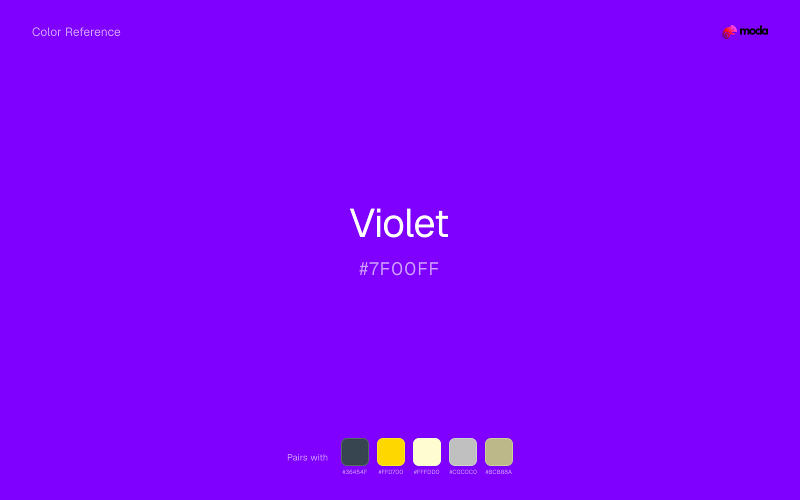
When violet is already bright, charcoal absorbs some of the visual heat and keeps the combination closer to beauty, nightlife, and creative-tech branding than to novelty graphics.
Gold warms violet enough to keep the palette from feeling chilly or overly technical, while still reading intentional rather than decorative-for-its-own-sake.
Cream takes the hard digital edge off violet and makes the color feel more printed, paper-backed, and approachable.
Silver stays quiet enough to frame violet instead of competing with it, which is useful for text, dividers, and supporting surfaces.
Sage Green changes the temperature story around violet: violet-blue on its own, more wellness, botanical, and lifestyle palettes once the cooler or warmer partner is introduced.
What colors clash with violet
Neon Green turns violet into something closer to screen glow than surface color, which is a mismatch for most editorial, product, or deck work.
Magenta remaps violet too aggressively, dragging it away from beauty, nightlife, and creative-tech branding and into a brighter, more performative palette.
How should I use violet in design?
- •On dark-mode dashboards, use violet for sparklines, focus rings, or active tab underlines where you need a purple that still pops against charcoal-style backgrounds.
- •For concert posters and event graphics, combine violet with deep near-black rather than pure #000000 to reduce color bleeding on home printers.
- •Check accessibility for any small text set in violet — shift toward a slightly lighter tint or use white knockout type with a heavier weight if contrast tools flag failures.
What are good violet palettes?
Design with violet in Moda
Create a presentation or document using violetas your accent color. Moda's AI applies your color palette automatically.
Create a design with violet →What are the shades and tints of violet?
Shades (darker)
Tints (lighter)
Tones (desaturated)
Hue variations
What are the color harmonies for violet?
Harmonies are calculated from the base swatch. When a harmony matches a named color page, it links there; otherwise it appears here as a computed reference swatch.
Similar colors
Grape
Grape is almost the same hue as violet; the real difference is value, with grape feeling more grounded and anchor-ready.
Amethyst
Amethyst is almost the same hue as violet; the real difference is value, with amethyst feeling more open and surface-friendly.
Royal Purple
Royal Purple is nearly adjacent to violet in hue; what separates them is intensity, with royal purple reading dustier and easier to extend across a layout.
Iris
Iris is useful when violet is the right weight but the wrong mood: the swap changes temperature and finish more than contrast.
Indigo
Indigo is close enough to violet to keep the palette cohesive, yet the lighter-darker shift still decides whether the family behaves more like atmosphere or more like structure.
Frequently asked questions
What is the hex code for violet?
The hex code for violet is #7F00FF. In RGB, that's 127 red, 0 green, and 255 blue. The approximate CMYK equivalent is 50% cyan, 100% magenta, 0% yellow, and 0% key (black).
Is violet a warm or cool color?
Violet sits near the center of the temperature scale but tips cool, which gives you room to steer the palette warmer or cooler with the surrounding accents.
Is violet better as an accent or a full-palette color?
Violet is usually best when it leads in short bursts rather than covering everything. It can headline a palette, but most layouts work better when the color handles accents, highlights, or one main hero role instead of every surface.
How should I use violet in a design?
Violet is vivid enough to work best in controlled doses such as CTAs, highlighted metrics, chart accents, or a single hero element. Surround it with quieter neutrals so it does not exhaust the layout.
Can I use violet for text or backgrounds?
Violet can work as text on white at 6.28:1 contrast, but it is usually safest in headings, labels, and accent moments rather than long body copy.
More purple colors
Keep exploring color resources
All color pages
Browse the full library of color references, pairings, and palettes.
Purple colors
Compare violet with other purple tones.
Blue colors
Explore nearby color families to build stronger palettes and contrasts.
Neutral colors
Explore nearby color families to build stronger palettes and contrasts.
Pink colors
Explore nearby color families to build stronger palettes and contrasts.
Last updated April 6, 2026
Color values are computed from the listed hex code using standard conversion formulas. RGB, HSL, and HSV are exact screen-ready conversions. CMYK is an approximate on-screen reference, not a press-ready print specification. Pairings, palettes, and use-case guidance are heuristic recommendations derived from color relationships, contrast behavior, and common presentation, document, and UI patterns.