Purple palettes and pairings
HEX
#800080
RGB
128, 0, 128
HSL
300°, 100%, 25%
HSV
300°, 100%, 50%
CSS purple (#800080) is a mid-to-dark magenta-leaning purple — exactly halfway between red and blue in the old 16-color VGA palette that shaped early computing. It is noticeably less electric than spectral violet and less brown than eggplant, sitting in a traditional "royal ribbon" territory. The hex works well when you want regal or nostalgic digital color without the neon punch of blue-violets.
Best for
Conference materials, keynote visuals, and thought-leadership content.
Accessibility
White text on purple passes AAA at 9.42:1, so it is safe for dark backgrounds and section headers.
How does purple compare to nearby colors?
What is the difference between purple and deep purple?
Purple (#800080) and Deep Purple (#36013F) are close enough that the split is more about finish than headline contrast: Purple feels more deep value, while Deep Purple reads more dark-anchor value. Purple stays more versatile in mixed-lightness systems because it does not immediately force the palette into a dark-mode posture. Begin with purple when the family needs its current undertone and surface character; keep deep purple for the nearby alternative that shifts the mood without leaving the same hue neighborhood.
What color is purple?
The web color purple (#800080) traces to the VGA/SVG/X11 lineage shared with the 16-color Windows and Mac classic palettes. Historically, Tyrian purple dye from marine snails was a luxury good in the ancient Mediterranean; modern #800080 is a distant digital echo of that history, not a pigment match.
What is the hex code for purple?
| Format | Value |
|---|---|
| HEX | #800080 |
| RGB | rgb(128, 0, 128) |
| HSL | hsl(300°, 100%, 25%) |
| HSV / HSB | hsv(300°, 100%, 50%) |
| CMYK (approx.) | cmyk(0%, 100%, 0%, 50%) |
Convert Purple to other color formats
Open the color converter with Purple (#800080) prefilled to copy RGB, HSL, HSV, CMYK, or OKLCH values.
Convert Purple in the color converter →What does purple mean in design?
In editorial and packaging mockups, #800080 often reads as classic or slightly vintage compared with brighter purples used in gaming and nightlife branding. It tends to feel more reserved than violet and less sugary than light pinks. Next to true blue, it usually reads as clearly purple rather than ambiguous indigo.
How do I use purple in code?
| CSS (hex) | color: #800080; |
| CSS (rgb) | color: rgb(128, 0, 128); |
| CSS (hsl) | color: hsl(300, 100%, 25%); |
| RGB % | rgb(50%, 0%, 50%) |
| Tailwind | text-[#800080] |
| SwiftUI | Color(red: 0.502, green: 0.000, blue: 0.502) |
| UIKit | UIColor(red: 0.502, green: 0.000, blue: 0.502, alpha: 1.0) |
| Android | Color.rgb(128, 0, 128) |
| Compose | Color(0xFF800080) |
| Web Safe | #990099 |
Is purple accessible?
| Combination | Ratio | AA | AA lg | AAA | AAA lg | UI |
|---|---|---|---|---|---|---|
| AaWhite text on this color | 9.42:1 | ✓ | ✓ | ✓ | ✓ | ✓ |
| AaBlack text on this color | 2.23:1 | ✗ | ✗ | ✗ | ✗ | ✗ |
| AaThis color as text on white | 9.42:1 | ✓ | ✓ | ✓ | ✓ | ✓ |
| AaThis color as text on black | 2.23:1 | ✗ | ✗ | ✗ | ✗ | ✗ |
WCAG 2.1: AA normal ≥ 4.5:1, AA large text ≥ 3:1, AAA normal ≥ 7:1, AAA large ≥ 4.5:1, UI components ≥ 3:1.
How does purple look with color blindness?
Simulated appearance for common types of color vision deficiency. Actual perception varies by individual.
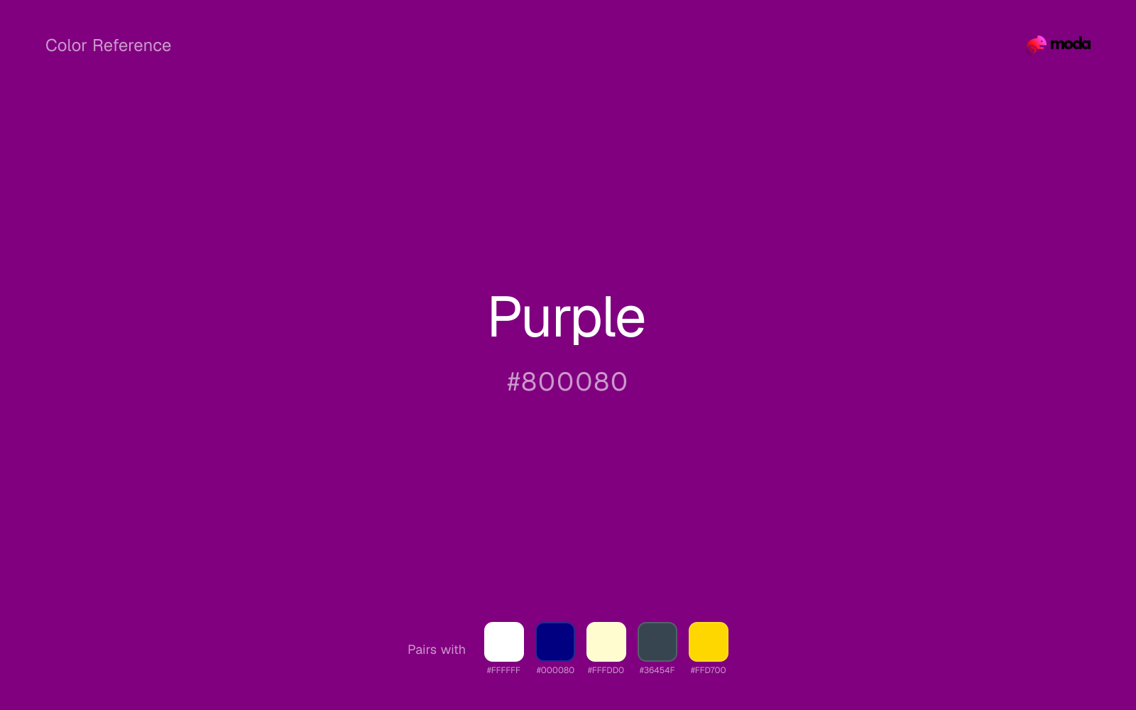
What colors go with purple
White helps purple stay legible in charts, labels, and UI states where a muddier light neutral would blur the edges.
Because purple already carries warmth, navy blue gives the pair a steadier backbone and keeps it closer to premium editorial work than to one-note seasonal color.
Cream takes the hard digital edge off purple and makes the color feel more printed, paper-backed, and approachable.
What colors clash with purple
Neon Green beside purple tends to vibrate on bright displays, so the pair reads more like a HUD effect than a considered brand palette.
With purple, magenta introduces a second emotional story instead of reinforcing the first one, so the palette can feel internally split.
Cyan redirects purple toward a more technical, backlit interpretation, which is risky when the goal is warmth, polish, or print-minded editorial work.
Pastel Pink can undercut purple's authority by turning the combination more decorative than decisive.
How should I use purple in design?
- •In long-form editorial PDFs, set #800080 headlines against warm off-white rather than pure white to reduce the slight vibration some readers perceive between deep purple and bright paper.
- •For slide titles, pair purple with gold or soft cream accents sparingly — large adjacent fields of saturated purple and yellow can fatigue quickly on screen.
- •In app icons tested at small sizes, simplify shapes when using #800080 fills; its mid darkness can merge with shadows unless you add a highlight edge.
What are good purple palettes?
Onyx foundation
Conference materials, keynote visuals, and thought-leadership content.
Design with purple in Moda
Create a presentation or document using purpleas your accent color. Moda's AI applies your color palette automatically.
Create a design with purple →What are the shades and tints of purple?
Shades (darker)
Tints (lighter)
Tones (desaturated)
Hue variations
What are the color harmonies for purple?
Harmonies are calculated from the base swatch. When a harmony matches a named color page, it links there; otherwise it appears here as a computed reference swatch.
Similar colors
Indigo
Indigo is useful when purple is the right weight but the wrong mood: the swap changes temperature and finish more than contrast.
Deep Purple
Deep Purple stays in the same color family as purple, but the change in value moves it into different layout jobs, especially once backgrounds, charts, or section dividers enter the system.
Plum
Plum is close enough to purple to keep the palette cohesive, yet the lighter-darker shift still decides whether the family behaves more like atmosphere or more like structure.
Grape
Grape tracks close to purple in hue, but the value shift changes where each one earns its place: grape is easier to use for backgrounds, tints, and softer supporting areas, while purple holds onto accents, stronger hierarchy, and firmer structure.
Eggplant
Eggplant keeps roughly the same visual weight as purple but changes the undertone story, which is often enough to move a palette from warmer and tactile to cooler and more technical, or the reverse.
Frequently asked questions
What is the hex code for purple?
The hex code for purple is #800080. In RGB, that's 128 red, 0 green, and 128 blue. The approximate CMYK equivalent is 0% cyan, 100% magenta, 0% yellow, and 50% key (black).
Is purple a warm or cool color?
Purple leans warm without feeling fully heat-driven, so you can push it warmer with cream, tan, or gold or balance it with cooler blues and slates.
Should purple lead the palette or stay in supporting roles?
Purple has enough chroma to take the lead, but it usually performs best when the surrounding system stays quieter. Treat it as the voice of emphasis, not the answer to every layout need.
Where does purple work best in a layout?
Purple has enough depth to anchor a layout while still reading as a color, which makes it useful for dark section blocks, headlines, and heavier accents.
Is purple accessible?
Purple is strong enough for white text at 9.42:1 contrast, so it can handle dark panels, tags, and section headers without much trouble. As text on white, though, it is usually better reserved for larger headings or short accents than for long paragraphs.
More purple colors
Keep exploring color resources
All color pages
Browse the full library of color references, pairings, and palettes.
Purple colors
Compare purple with other purple tones.
Blue colors
Explore nearby color families to build stronger palettes and contrasts.
Neutral colors
Explore nearby color families to build stronger palettes and contrasts.
Pink colors
Explore nearby color families to build stronger palettes and contrasts.
Last updated April 6, 2026
Color values are computed from the listed hex code using standard conversion formulas. RGB, HSL, and HSV are exact screen-ready conversions. CMYK is an approximate on-screen reference, not a press-ready print specification. Pairings, palettes, and use-case guidance are heuristic recommendations derived from color relationships, contrast behavior, and common presentation, document, and UI patterns.