Using Mauve in design
HEX
#E0B0FF
RGB
224, 176, 255
HSL
276°, 100%, 85%
HSV
276°, 31%, 100%
Mauve reads as a whispered purple — washed, slightly grayed, and comfortably vintage. #E0B0FF's invention as a synthetic dye helped define Victorian fashion, and that heritage still lingers in how soft and "period" it feels. On interfaces it behaves like a neutral with a lilac tint.
Best for
Internal tools, team dashboards, and knowledge-base layouts.
Accessibility
Check contrast before using mauve for text-heavy layouts, especially on low-contrast backgrounds.
How does mauve compare to nearby colors?
What is the difference between mauve and wisteria?
Wisteria (#C9A0DC) carries less pigment punch than Mauve (#E0B0FF), so the pair separates by finish as much as hue. Mauve opens more space around content, while Wisteria can still carry clearer emphasis and stronger edges. Choose mauve when the color needs to register quickly and act like the headline accent; keep wisteria when the rest of the layout needs a quieter companion.
What color is mauve?
The first synthetic dye, mauveine, gave the name global fame in the mid-19th century. Mauve appears in textiles, interior paint lines, and branding that wants understated femininity or antique mood.
What is the hex code for mauve?
| Format | Value |
|---|---|
| HEX | #E0B0FF |
| RGB | rgb(224, 176, 255) |
| HSL | hsl(276°, 100%, 85%) |
| HSV / HSB | hsv(276°, 31%, 100%) |
| CMYK (approx.) | cmyk(12%, 31%, 0%, 0%) |
Convert Mauve to other color formats
Open the color converter with Mauve (#E0B0FF) prefilled to copy RGB, HSL, HSV, CMYK, or OKLCH values.
Convert Mauve in the color converter →What does mauve mean in design?
Mauve is often associated with nostalgia, gentleness, and quiet sophistication. Next to brighter lilac or wisteria, mauve tends to read dustier and more muted; beside eggplant it feels pastel and daylight.
How do I use mauve in code?
| CSS (hex) | color: #E0B0FF; |
| CSS (rgb) | color: rgb(224, 176, 255); |
| CSS (hsl) | color: hsl(276, 100%, 85%); |
| RGB % | rgb(88%, 69%, 100%) |
| Tailwind | text-[#E0B0FF] |
| SwiftUI | Color(red: 0.878, green: 0.690, blue: 1.000) |
| UIKit | UIColor(red: 0.878, green: 0.690, blue: 1.000, alpha: 1.0) |
| Android | Color.rgb(224, 176, 255) |
| Compose | Color(0xFFE0B0FF) |
| Web Safe | #CC99FF |
Is mauve accessible?
| Combination | Ratio | AA | AA lg | AAA | AAA lg | UI |
|---|---|---|---|---|---|---|
| AaWhite text on this color | 1.78:1 | ✗ | ✗ | ✗ | ✗ | ✗ |
| AaBlack text on this color | 11.82:1 | ✓ | ✓ | ✓ | ✓ | ✓ |
| AaThis color as text on white | 1.78:1 | ✗ | ✗ | ✗ | ✗ | ✗ |
| AaThis color as text on black | 11.82:1 | ✓ | ✓ | ✓ | ✓ | ✓ |
WCAG 2.1: AA normal ≥ 4.5:1, AA large text ≥ 3:1, AAA normal ≥ 7:1, AAA large ≥ 4.5:1, UI components ≥ 3:1.
How does mauve look with color blindness?
Simulated appearance for common types of color vision deficiency. Actual perception varies by individual.
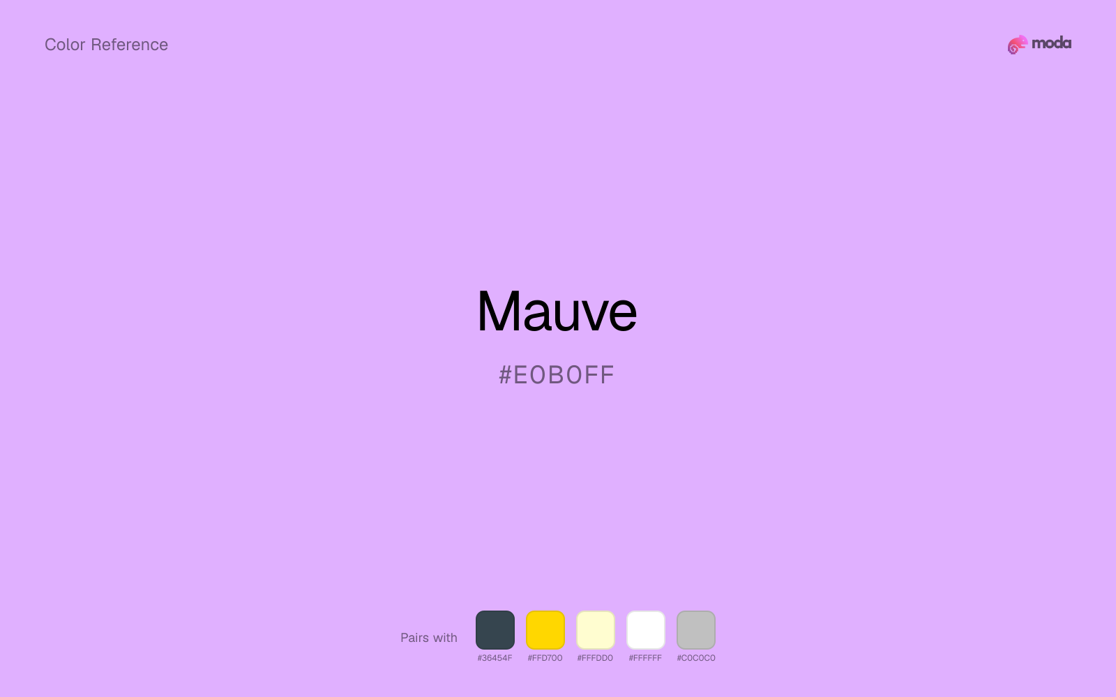
What colors go with mauve
Charcoal gives mauve the dark frame it is missing, so pale surfaces do not drift into a washed-out page.
Gold warms mauve enough to keep the palette from feeling chilly or overly technical, while still reading intentional rather than decorative-for-its-own-sake.
Cream lets mauve stay expressive without turning the whole composition stark; the result feels closer to editorial or packaging work than to raw UI default.
What colors clash with mauve
Neon Green beside mauve tends to vibrate on bright displays, so the pair reads more like a HUD effect than a considered brand palette.
With mauve, magenta introduces a second emotional story instead of reinforcing the first one, so the palette can feel internally split.
Orange changes the context around mauve so quickly that the palette can start looking campaign-specific rather than durable.
Light Gray sits too close to mauve in value, so the palette can wash out before it ever establishes a clear hierarchy.
How should I use mauve in design?
- •Use mauve for soft backgrounds and supporting surfaces rather than foreground text — it creates a gentle atmosphere while keeping the layout open and readable.
- •Warm touches like gold or coral bring out mauve's cooler character by contrast, while staying with cool neighbors creates a calmer, more unified feel.
- •Light tones like mauve work best for card backgrounds, section tints, and gentle emphasis — they add color without competing with the content.
What are good mauve palettes?
Clear signal
Internal tools, team dashboards, and knowledge-base layouts.
Golden hour
Brand guidelines, design systems, and visual identity documents.
Design with mauve in Moda
Create a presentation or document using mauveas your accent color. Moda's AI applies your color palette automatically.
Create a design with mauve →What are the shades and tints of mauve?
Shades (darker)
Tints (lighter)
Tones (desaturated)
Hue variations
What are the color harmonies for mauve?
Harmonies are calculated from the base swatch. When a harmony matches a named color page, it links there; otherwise it appears here as a computed reference swatch.
Similar colors
Wisteria
Wisteria is almost the same hue as mauve; the real difference is value, with wisteria feeling more grounded and anchor-ready.
Periwinkle
Periwinkle keeps some overlap with mauve, but the shift in finish and association is enough to make one feel better suited to this particular layout than the other.
Lavender
Lavender changes the chroma more than the hue, so the decision is really about temperament: more immediate and screen-bright, or more restrained and spreadable.
Lilac
Lilac tracks close to mauve in hue, but the value shift changes where each one earns its place: lilac is easier to use for headlines, anchors, and darker sections, while mauve holds onto lighter surfaces and more open applications.
Orchid
Orchid tracks close to mauve in hue, but the value shift changes where each one earns its place: orchid is easier to use for headlines, anchors, and darker sections, while mauve holds onto lighter surfaces and more open applications.
Frequently asked questions
What is the hex code for mauve?
The hex code for mauve is #E0B0FF. In RGB, that's 224 red, 176 green, and 255 blue. The approximate CMYK equivalent is 12% cyan, 31% magenta, 0% yellow, and 0% key (black).
Is mauve a warm or cool color?
Mauve leans cool but is not icy, so it can stay composed with blues and greens or feel more balanced when warmed up with cream, tan, or muted gold.
Should mauve be used as a surface color or an accent?
Mauve belongs more naturally on surfaces than in tiny accent moments. Use it to open space, soften sections, or tint large areas, then let darker colors carry the emphasis.
Where does mauve work best in a layout?
Mauve is very light, so it works best as a background, card fill, or table tint in slides, documents, and landing pages. Pair it with dark text such as charcoal or navy for readability.
Is mauve accessible?
Mauve works better with dark text than white text. Black text reaches 11.82:1 contrast on the swatch, which makes the color more usable as a background or highlight surface than as a dark panel.
More purple colors
Keep exploring color resources
All color pages
Browse the full library of color references, pairings, and palettes.
Purple colors
Compare mauve with other purple tones.
Blue colors
Explore nearby color families to build stronger palettes and contrasts.
Neutral colors
Explore nearby color families to build stronger palettes and contrasts.
Pink colors
Explore nearby color families to build stronger palettes and contrasts.
Last updated April 6, 2026
Color values are computed from the listed hex code using standard conversion formulas. RGB, HSL, and HSV are exact screen-ready conversions. CMYK is an approximate on-screen reference, not a press-ready print specification. Pairings, palettes, and use-case guidance are heuristic recommendations derived from color relationships, contrast behavior, and common presentation, document, and UI patterns.