Cornflower meaning and palette guide
HEX
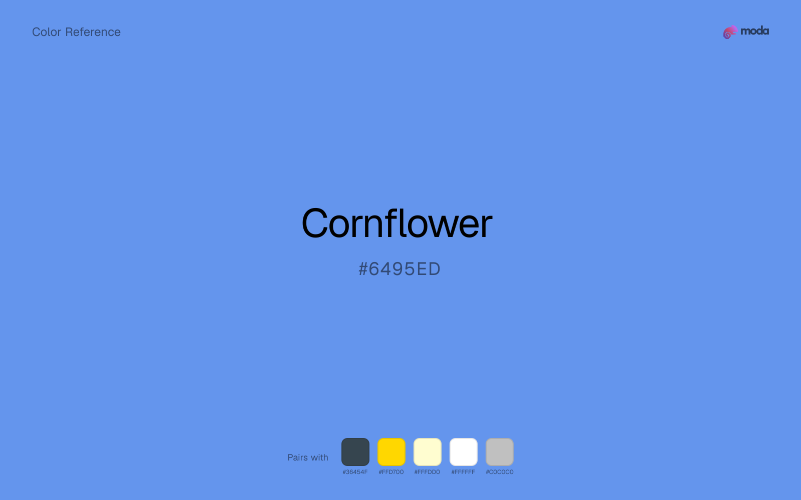
#6495ED
RGB
100, 149, 237
HSL
219°, 79%, 66%
HSV
219°, 58%, 93%
Named for a meadow flower, cornflower carries a violet undertone that separates it from straight primaries. #6495ED feels illustrative and botanical rather than tech-default. On white it is readable; on gray it can turn moody.
Best for
Marketing websites, social media graphics, and campaign landing pages.
Compare with
Accessibility
Check contrast before using cornflower for text-heavy layouts, especially on low-contrast backgrounds.
How does cornflower compare to nearby colors?
What is the difference between cornflower and baby blue?
Cornflower (#6495ED) and Baby Blue (#89CFF0) are close in strength, but they point the eye toward different undertones and material cues. Cornflower gives the palette a more grounded center of gravity, which matters if headlines, UI chrome, or darker sections need to feel settled. Choose cornflower when the surrounding system aligns better with app UI, charts, and digital-native branding, and move to baby blue when the stronger contextual fit is healthcare, airy product surfaces, and calm interfaces.
What color is cornflower?
Cornflower blue names a specific wildflower (Centaurea cyanus) and a classic crayon/paint shade. It appears in florals, stationery, and heritage European design references.
What is the hex code for cornflower?
| Format | Value |
|---|---|
| HEX | #6495ED |
| RGB | rgb(100, 149, 237) |
| HSL | hsl(219°, 79%, 66%) |
| HSV / HSB | hsv(219°, 58%, 93%) |
| CMYK (approx.) | cmyk(58%, 37%, 0%, 7%) |
Convert Cornflower to other color formats
Open the color converter with Cornflower (#6495ED) prefilled to copy RGB, HSL, HSV, CMYK, or OKLCH values.
Convert Cornflower in the color converter →What does cornflower mean in design?
Cornflower is often associated with countryside, romance, and handcrafted charm. Compared with slate blue or periwinkle, it tends to read as more saturated and floral, less grayed and less pastel-lavender.
How do I use cornflower in code?
| CSS (hex) | color: #6495ED; |
| CSS (rgb) | color: rgb(100, 149, 237); |
| CSS (hsl) | color: hsl(219, 79%, 66%); |
| RGB % | rgb(39%, 58%, 93%) |
| Tailwind | text-[#6495ED] |
| SwiftUI | Color(red: 0.392, green: 0.584, blue: 0.929) |
| UIKit | UIColor(red: 0.392, green: 0.584, blue: 0.929, alpha: 1.0) |
| Android | Color.rgb(100, 149, 237) |
| Compose | Color(0xFF6495ED) |
| Web Safe | #6699FF |
Is cornflower accessible?
| Combination | Ratio | AA | AA lg | AAA | AAA lg | UI |
|---|---|---|---|---|---|---|
| AaWhite text on this color | 2.97:1 | ✗ | ✗ | ✗ | ✗ | ✗ |
| AaBlack text on this color | 7.06:1 | ✓ | ✓ | ✓ | ✓ | ✓ |
| AaThis color as text on white | 2.97:1 | ✗ | ✗ | ✗ | ✗ | ✗ |
| AaThis color as text on black | 7.06:1 | ✓ | ✓ | ✓ | ✓ | ✓ |
WCAG 2.1: AA normal ≥ 4.5:1, AA large text ≥ 3:1, AAA normal ≥ 7:1, AAA large ≥ 4.5:1, UI components ≥ 3:1.
How does cornflower look with color blindness?
Simulated appearance for common types of color vision deficiency. Actual perception varies by individual.
What colors go with cornflower
Charcoal lets cornflower stay light and atmospheric while still giving the layout a readable dark value for text and hierarchy.
Gold warms cornflower enough to keep the palette from feeling chilly or overly technical, while still reading intentional rather than decorative-for-its-own-sake.
Cream lets cornflower stay expressive without turning the whole composition stark; the result feels closer to editorial or packaging work than to raw UI default.
What colors clash with cornflower
Neon Green turns cornflower into something closer to screen glow than surface color, which is a mismatch for most editorial, product, or deck work.
Magenta pushes cornflower toward a nightclub or cosmetic register that is hard to square with calmer editorial or product work.
How should I use cornflower in design?
- •Use cornflower for buttons, badges, and chart accents where it can stand out. Test text contrast with WCAG tools before using it for body copy on light backgrounds.
- •Pair cornflower with warm accents (gold, rust, amber) when you need more energy, or stay in cool territory (navy, silver, sage) for a composed, professional look.
- •Vivid colors like cornflower work best as punctuation in a layout: CTAs, key metrics, or a single hero element. Surrounding neutrals keep it from fatiguing the viewer.
What are good cornflower palettes?
Clear signal
Marketing websites, social media graphics, and campaign landing pages.
Design with cornflower in Moda
Create a presentation or document using cornfloweras your accent color. Moda's AI applies your color palette automatically.
Create a design with cornflower →What are the shades and tints of cornflower?
Shades (darker)
Tints (lighter)
Tones (desaturated)
Hue variations
What are the color harmonies for cornflower?
Harmonies are calculated from the base swatch. When a harmony matches a named color page, it links there; otherwise it appears here as a computed reference swatch.
Similar colors
Royal Blue
Royal Blue is almost the same hue as cornflower; the real difference is value, with royal blue feeling more grounded and anchor-ready.
Baby Blue
Baby Blue is useful when cornflower is the right weight but the wrong mood: the swap changes temperature and finish more than contrast.
Sky Blue
Sky Blue occupies a similar depth to cornflower, though it pushes the family toward a more cool reading and a different material feel.
Steel Blue
Steel Blue tracks close to cornflower in hue, but the value shift changes where each one earns its place: steel blue is easier to use for headlines, anchors, and darker sections, while cornflower holds onto lighter surfaces and more open applications.
Cool Gray
Cool Gray sits close to cornflower on the wheel, but it carries less chroma, which makes it better for steadier surfaces and calmer long-form use than for sharper emphasis and quicker visual pickup.
Frequently asked questions
What is the hex code for cornflower?
The hex code for cornflower is #6495ED. In RGB, that's 100 red, 149 green, and 237 blue. The approximate CMYK equivalent is 58% cyan, 37% magenta, 0% yellow, and 7% key (black).
Is cornflower a warm or cool color?
Cornflower reads as cool. It settles naturally beside blues, greens, silver, and charcoal, and feels more animated when paired with warm accents like gold, coral, or rust.
Is cornflower better as an accent or a full-palette color?
Cornflower is usually best when it leads in short bursts rather than covering everything. It can headline a palette, but most layouts work better when the color handles accents, highlights, or one main hero role instead of every surface.
How should I use cornflower in a design?
Cornflower is versatile enough for headlines, accent bars, buttons, charts, or section backgrounds depending on the contrast around it. It works as either a primary or supporting color in decks, documents, and brand systems.
Can I use cornflower for text or backgrounds?
Cornflower works better with dark text than white text. Black text reaches 7.06:1 contrast on the swatch, which makes the color more usable as a background or highlight surface than as a dark panel.
More blue colors
Keep exploring color resources
All color pages
Browse the full library of color references, pairings, and palettes.
Blue colors
Compare cornflower with other blue tones.
Green colors
Explore nearby color families to build stronger palettes and contrasts.
Neutral colors
Explore nearby color families to build stronger palettes and contrasts.
Purple colors
Explore nearby color families to build stronger palettes and contrasts.
Last updated April 6, 2026
Color values are computed from the listed hex code using standard conversion formulas. RGB, HSL, and HSV are exact screen-ready conversions. CMYK is an approximate on-screen reference, not a press-ready print specification. Pairings, palettes, and use-case guidance are heuristic recommendations derived from color relationships, contrast behavior, and common presentation, document, and UI patterns.