Steel Blue color guide
HEX
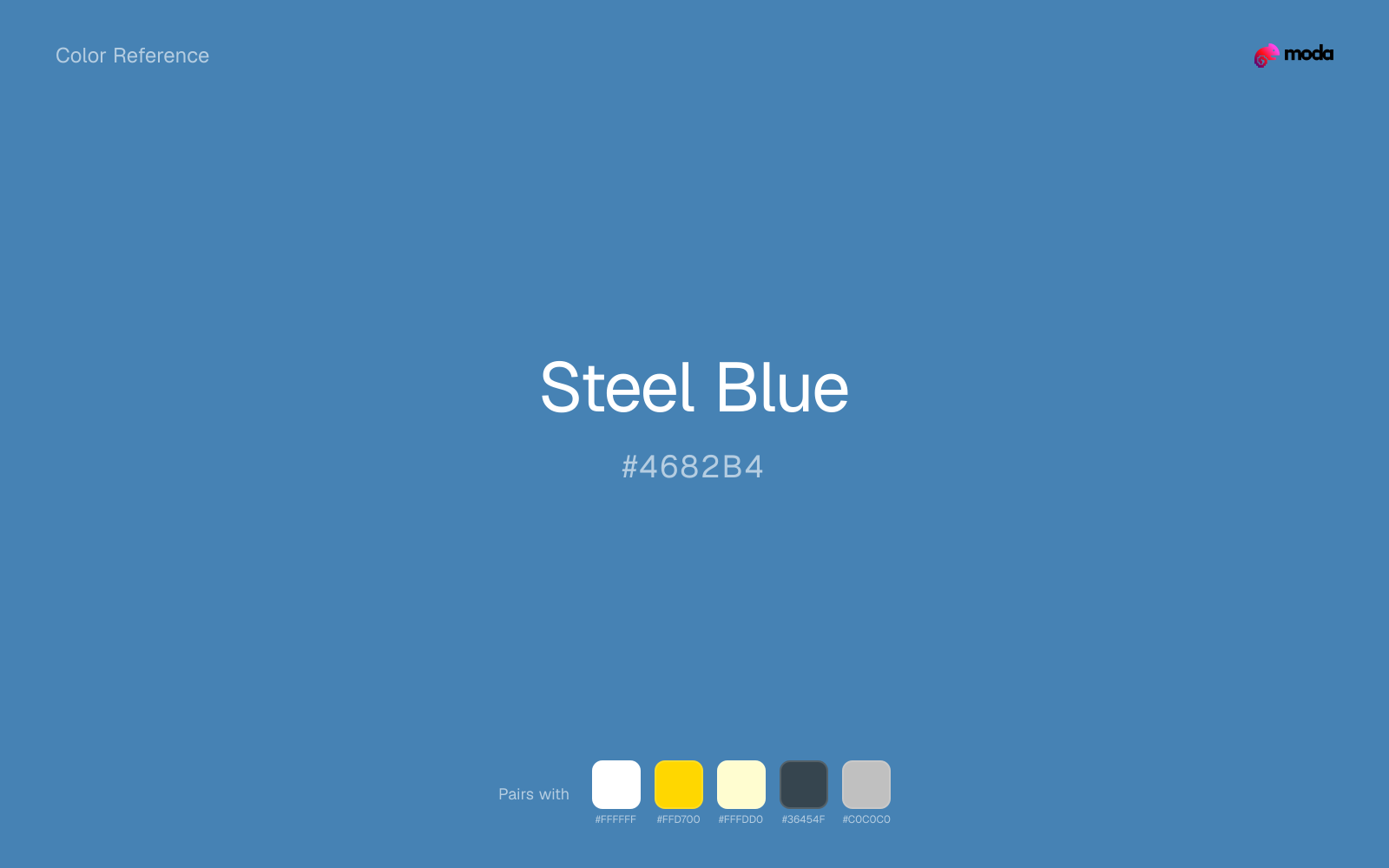
#4682B4
RGB
70, 130, 180
HSL
207°, 44%, 49%
HSV
207°, 61%, 71%
Cool metal without chrome glare — this is the blue-gray of tools, bridges, and office chairs. #4682B4 communicates function before feeling. In UI, it often stands in for "serious SaaS."
Best for
Corporate branding, executive reports, and enterprise-level web design.
Compare with
Accessibility
Check contrast before using steel blue for text-heavy layouts, especially on low-contrast backgrounds.
How does steel blue compare to nearby colors?
What is the difference between steel blue and slate gray?
Steel Blue (#4682B4) looks cleaner and more charged than Slate Gray (#708090) when the two are shown together. Steel Blue is more useful when the color itself needs to do some signaling; Slate Gray is easier to keep in longer-running surfaces. Reach for steel blue when the palette can tolerate a louder note; stay with slate gray when the work calls for longer-running color.
What color is steel blue?
Common in industrial coatings, CAD interfaces, workwear, and corporate templates where blue must feel restrained. The name explicitly ties the hue to steel surfaces.
What is the hex code for steel blue?
| Format | Value |
|---|---|
| HEX | #4682B4 |
| RGB | rgb(70, 130, 180) |
| HSL | hsl(207°, 44%, 49%) |
| HSV / HSB | hsv(207°, 61%, 71%) |
| CMYK (approx.) | cmyk(61%, 28%, 0%, 29%) |
Convert Steel Blue to other color formats
Open the color converter with Steel Blue (#4682B4) prefilled to copy RGB, HSL, HSV, CMYK, or OKLCH values.
Convert Steel Blue in the color converter →What does steel blue mean in design?
Steel blue is often associated with reliability, engineering, and no-nonsense professionalism. Next to slate blue or denim, it tends to read as grayer, colder, and less purple or fashion-forward.
How do I use steel blue in code?
| CSS (hex) | color: #4682B4; |
| CSS (rgb) | color: rgb(70, 130, 180); |
| CSS (hsl) | color: hsl(207, 44%, 49%); |
| RGB % | rgb(27%, 51%, 71%) |
| Tailwind | text-[#4682B4] |
| SwiftUI | Color(red: 0.275, green: 0.510, blue: 0.706) |
| UIKit | UIColor(red: 0.275, green: 0.510, blue: 0.706, alpha: 1.0) |
| Android | Color.rgb(70, 130, 180) |
| Compose | Color(0xFF4682B4) |
| Web Safe | #3399CC |
Is steel blue accessible?
| Combination | Ratio | AA | AA lg | AAA | AAA lg | UI |
|---|---|---|---|---|---|---|
| AaWhite text on this color | 4.11:1 | ✗ | ✓ | ✗ | ✗ | ✓ |
| AaBlack text on this color | 5.11:1 | ✓ | ✓ | ✗ | ✓ | ✓ |
| AaThis color as text on white | 4.11:1 | ✗ | ✓ | ✗ | ✗ | ✓ |
| AaThis color as text on black | 5.11:1 | ✓ | ✓ | ✗ | ✓ | ✓ |
WCAG 2.1: AA normal ≥ 4.5:1, AA large text ≥ 3:1, AAA normal ≥ 7:1, AAA large ≥ 4.5:1, UI components ≥ 3:1.
How does steel blue look with color blindness?
Simulated appearance for common types of color vision deficiency. Actual perception varies by individual.
What colors go with steel blue
White makes steel blue feel clearer and more breathable without pulling it warmer or cooler than it already is.
With a cooler color like steel blue, gold adds richness and turns the system toward premium packaging, hospitality, or ceremonial branding.
Pairing steel blue with cream keeps the palette relaxed and material, which is useful when a bright white would feel too crisp.
What colors clash with steel blue
Neon Green turns steel blue into something closer to screen glow than surface color, which is a mismatch for most editorial, product, or deck work.
Magenta remaps steel blue too aggressively, dragging it away from technical documentation and steady editorial work and into a brighter, more performative palette.
How should I use steel blue in design?
- •Try steel blue for section backgrounds, card fills, or brand-secondary roles where you want color without overpowering the content.
- •Steel Blue leans cool, so warm accents like gold, coral, or rust add the most energy. For a calm, professional palette, stay with other cool tones and use value contrast instead.
- •Steel Blue is a safe choice for corporate decks, SaaS dashboards, and enterprise UI — contexts where trustworthiness is the first design requirement.
What are good steel blue palettes?
Dark precision
Corporate branding, executive reports, and enterprise-level web design.
Design with steel blue in Moda
Create a presentation or document using steel blueas your accent color. Moda's AI applies your color palette automatically.
Create a design with steel blue →What are the shades and tints of steel blue?
Shades (darker)
Tints (lighter)
Tones (desaturated)
Hue variations
What are the color harmonies for steel blue?
Harmonies are calculated from the base swatch. When a harmony matches a named color page, it links there; otherwise it appears here as a computed reference swatch.
Similar colors
Slate Gray
Slate Gray sits close to steel blue on the wheel, but it carries less chroma, which makes it better for steadier surfaces and calmer long-form use than for sharper emphasis and quicker visual pickup.
Denim
Denim is almost the same hue as steel blue; the real difference is value, with denim feeling more grounded and anchor-ready.
Royal Blue
Royal Blue occupies a similar depth to steel blue, though it pushes the family toward a more cool reading and a different material feel.
Sapphire
Sapphire stays very close to steel blue in hue, but it lands darker, which makes it better for headlines, anchors, and darker sections than for lighter surfaces and more open applications.
Ocean Blue
Ocean Blue stays in the same color family as steel blue, but the change in value moves it into different layout jobs, especially once backgrounds, charts, or section dividers enter the system.
Frequently asked questions
What is the hex code for steel blue?
The hex code for steel blue is #4682B4. In RGB, that's 70 red, 130 green, and 180 blue. The approximate CMYK equivalent is 61% cyan, 28% magenta, 0% yellow, and 29% key (black).
Is steel blue a warm or cool color?
Steel Blue reads as cool. It settles naturally beside blues, greens, silver, and charcoal, and feels more animated when paired with warm accents like gold, coral, or rust.
Where does steel blue work best in a layout?
Steel Blue is flexible enough to move between accents, section blocks, and supporting roles depending on the contrast around it. It works best when the rest of the palette gives it a clear job instead of asking it to do everything at once.
How should I use steel blue in a design?
Steel Blue is versatile enough for headlines, accent bars, buttons, charts, or section backgrounds depending on the contrast around it. It works as either a primary or supporting color in decks, documents, and brand systems.
Can I use steel blue for text or backgrounds?
Steel Blue works better with dark text than white text. Black text reaches 5.11:1 contrast on the swatch, which makes the color more usable as a background or highlight surface than as a dark panel.
More blue colors
Keep exploring color resources
All color pages
Browse the full library of color references, pairings, and palettes.
Blue colors
Compare steel blue with other blue tones.
Green colors
Explore nearby color families to build stronger palettes and contrasts.
Neutral colors
Explore nearby color families to build stronger palettes and contrasts.
Purple colors
Explore nearby color families to build stronger palettes and contrasts.
Last updated April 6, 2026
Color values are computed from the listed hex code using standard conversion formulas. RGB, HSL, and HSV are exact screen-ready conversions. CMYK is an approximate on-screen reference, not a press-ready print specification. Pairings, palettes, and use-case guidance are heuristic recommendations derived from color relationships, contrast behavior, and common presentation, document, and UI patterns.