Snow design guide
HEX
#FFFAFA
RGB
255, 250, 250
HSL
0°, 100%, 99%
HSV
0°, 2%, 100%
Cold light tints it — less "blank page," more "dawn on fresh powder." #FFFAFA has a faint rosiness that keeps it from feeling clinical while still behaving as a near-white. Ideal when you want brightness with a hint of atmosphere.
Best for
Educational platforms, course materials, and infographic designs.
Accessibility
Check contrast before using snow for text-heavy layouts, especially on low-contrast backgrounds.
How does snow compare to nearby colors?
What is the difference between snow and white?
White (#FFFFFF) carries less pigment punch than Snow (#FFFAFA), so the pair separates by finish as much as hue. Snow reads faster on screen, so it changes the palette from steady to attention-seeking more quickly than White does. Choose snow when the color needs to register quickly and act like the headline accent; keep white when the rest of the layout needs a quieter companion.
What color is snow?
Named for snow's appearance under varied skylight. Used in winter-themed palettes, bridal design, and soft UI backgrounds. #FFFAFA is a recognized named "snow" in web color references.
What is the hex code for snow?
| Format | Value |
|---|---|
| HEX | #FFFAFA |
| RGB | rgb(255, 250, 250) |
| HSL | hsl(0°, 100%, 99%) |
| HSV / HSB | hsv(0°, 2%, 100%) |
| CMYK (approx.) | cmyk(0%, 2%, 2%, 0%) |
Convert Snow to other color formats
Open the color converter with Snow (#FFFAFA) prefilled to copy RGB, HSL, HSV, CMYK, or OKLCH values.
Convert Snow in the color converter →What does snow mean in design?
Snow is often associated with purity, quiet freshness, and gentle romance. It reads as cooler and more ethereal than off-white or alabaster, with a subtle pink cast.
How do I use snow in code?
| CSS (hex) | color: #FFFAFA; |
| CSS (rgb) | color: rgb(255, 250, 250); |
| CSS (hsl) | color: hsl(0, 100%, 99%); |
| RGB % | rgb(100%, 98%, 98%) |
| Tailwind | text-[#FFFAFA] |
| SwiftUI | Color(red: 1.000, green: 0.980, blue: 0.980) |
| UIKit | UIColor(red: 1.000, green: 0.980, blue: 0.980, alpha: 1.0) |
| Android | Color.rgb(255, 250, 250) |
| Compose | Color(0xFFFFFAFA) |
| Web Safe | #FFFFFF |
Is snow accessible?
| Combination | Ratio | AA | AA lg | AAA | AAA lg | UI |
|---|---|---|---|---|---|---|
| AaWhite text on this color | 1.03:1 | ✗ | ✗ | ✗ | ✗ | ✗ |
| AaBlack text on this color | 20.31:1 | ✓ | ✓ | ✓ | ✓ | ✓ |
| AaThis color as text on white | 1.03:1 | ✗ | ✗ | ✗ | ✗ | ✗ |
| AaThis color as text on black | 20.31:1 | ✓ | ✓ | ✓ | ✓ | ✓ |
WCAG 2.1: AA normal ≥ 4.5:1, AA large text ≥ 3:1, AAA normal ≥ 7:1, AAA large ≥ 4.5:1, UI components ≥ 3:1.
How does snow look with color blindness?
Simulated appearance for common types of color vision deficiency. Actual perception varies by individual.
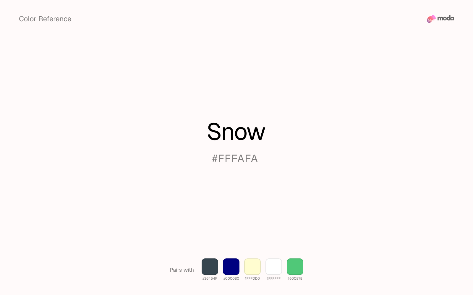
What colors go with snow
Because snow behaves like a tint, charcoal supplies the typography, dividers, and anchors that make the palette feel finished.
Because snow already carries warmth, navy blue gives the pair a steadier backbone and keeps it closer to editorial systems than to one-note seasonal color.
With a vivid snow, cream is gentler than white, so the palette keeps warmth and avoids looking overlit.
What colors clash with snow
Neon Green makes snow feel cheaper and less material, which is exactly the opposite of what these grounded colors usually contribute.
Magenta remaps snow too aggressively, dragging it away from inviting editorial surfaces and into a brighter, more performative palette.
Cyan can make snow feel more software-default than designed, especially when the rest of the palette is trying to hold onto material nuance.
Light Gray sits too close to snow in value, so the palette can wash out before it ever establishes a clear hierarchy.
How should I use snow in design?
- •Use snow as a near-white alternative for backgrounds and paper-like surfaces where you want a hint of color without any visual weight.
- •Snow leans warm, so cool counterparts like navy, teal, or slate create the cleanest contrast. For a softer, tonal look, stay within neighboring warm hues and let value differences do the work.
- •Snow's lightness makes it a good candidate for email backgrounds, slide canvases, and page sections where you want atmosphere, not distraction.
What are good snow palettes?
Design with snow in Moda
Create a presentation or document using snowas your accent color. Moda's AI applies your color palette automatically.
Create a design with snow →What are the shades and tints of snow?
Shades (darker)
Tints (lighter)
Tones (desaturated)
Hue variations
What are the color harmonies for snow?
Harmonies are calculated from the base swatch. When a harmony matches a named color page, it links there; otherwise it appears here as a computed reference swatch.
Similar colors
White
White is nearly adjacent to snow in hue; what separates them is intensity, with white reading dustier and easier to extend across a layout.
Ivory
Ivory keeps some overlap with snow, but the shift in finish and association is enough to make one feel better suited to this particular layout than the other.
Off-White
Off-White turns the same general family toward a different energy level, which matters if the palette should feel punchier, dustier, more cosmetic, or more editorial.
Light Gray
Light Gray tracks close to snow in hue, but the value shift changes where each one earns its place: light gray is easier to use for headlines, anchors, and darker sections, while snow holds onto lighter surfaces and more open applications.
Champagne
Champagne changes the chroma more than the hue, so the decision is really about temperament: more immediate and screen-bright, or more restrained and spreadable.
Frequently asked questions
What is the hex code for snow?
The hex code for snow is #FFFAFA. In RGB, that's 255 red, 250 green, and 250 blue. The approximate CMYK equivalent is 0% cyan, 2% magenta, 2% yellow, and 0% key (black).
Is snow a warm or cool color?
Snow reads as warm. It feels most natural with creams, golds, rusts, and other warm accents, while cooler partners like navy or teal create sharper contrast.
Is snow better for backgrounds or accents?
Snow is usually stronger as a background, card tint, or section surface than as a sharp accent. It works best when darker typography or controls can sit on top and do the hierarchy work.
How should I use snow in a design?
Snow is light enough that it belongs on surfaces rather than in small text. Use it for backgrounds, soft section breaks, or gentle table shading and keep dark typography on top.
Can I use snow for text or backgrounds?
Snow works better with dark text than white text. Black text reaches 20.31:1 contrast on the swatch, which makes the color more usable as a background or highlight surface than as a dark panel.
More neutral colors
Keep exploring color resources
All color pages
Browse the full library of color references, pairings, and palettes.
Neutral colors
Compare snow with other neutral tones.
Blue colors
Explore nearby color families to build stronger palettes and contrasts.
Brown colors
Explore nearby color families to build stronger palettes and contrasts.
Green colors
Explore nearby color families to build stronger palettes and contrasts.
Last updated April 6, 2026
Color values are computed from the listed hex code using standard conversion formulas. RGB, HSL, and HSV are exact screen-ready conversions. CMYK is an approximate on-screen reference, not a press-ready print specification. Pairings, palettes, and use-case guidance are heuristic recommendations derived from color relationships, contrast behavior, and common presentation, document, and UI patterns.