Papaya for backgrounds and palettes
HEX
#FFEFD5
RGB
255, 239, 213
HSL
37°, 100%, 92%
HSV
37°, 16%, 100%
An extremely pale yellow-orange that behaves like tinted cream — warmth barely there until you place it beside true white. #FFEFD5 is ideal for airy backgrounds, paper-like surfaces, and delicate highlights where peach would feel too pink. It matches the familiar "PapayaWhip" swatch — soft, milky, and low-contrast.
Best for
Mobile app interfaces, onboarding screens, and light-mode UI themes.
Accessibility
Check contrast before using papaya for text-heavy layouts, especially on low-contrast backgrounds.
How does papaya compare to nearby colors?
What is the difference between papaya and apricot?
Papaya (#FFEFD5) and Apricot (#FBCEB1) are close enough that the split is more about finish than headline contrast: Papaya feels more airy value, while Apricot reads more light value. Papaya lightens the palette overall and makes it easier to keep the page feeling open rather than heavy. Begin with papaya when the family needs its current undertone and surface character; keep apricot for the nearby alternative that shifts the mood without leaving the same hue neighborhood.
What color is papaya?
The name references papaya fruit, but this particular near-white tone is widely recognized in digital design as a standard named pale. It commonly appears in default palettes and gentle UI theming.
What is the hex code for papaya?
| Format | Value |
|---|---|
| HEX | #FFEFD5 |
| RGB | rgb(255, 239, 213) |
| HSL | hsl(37°, 100%, 92%) |
| HSV / HSB | hsv(37°, 16%, 100%) |
| CMYK (approx.) | cmyk(0%, 6%, 16%, 0%) |
Convert Papaya to other color formats
Open the color converter with Papaya (#FFEFD5) prefilled to copy RGB, HSL, HSV, CMYK, or OKLCH values.
Convert Papaya in the color converter →What does papaya mean in design?
Papaya tends to read as calm, clean, and subtly cozy. Compared with apricot or peach, papaya is usually much lighter and more yellow-neutral; it is not an accent color so much as a whispered suggestion of sunlight.
How do I use papaya in code?
| CSS (hex) | color: #FFEFD5; |
| CSS (rgb) | color: rgb(255, 239, 213); |
| CSS (hsl) | color: hsl(37, 100%, 92%); |
| RGB % | rgb(100%, 94%, 84%) |
| Tailwind | text-[#FFEFD5] |
| SwiftUI | Color(red: 1.000, green: 0.937, blue: 0.835) |
| UIKit | UIColor(red: 1.000, green: 0.937, blue: 0.835, alpha: 1.0) |
| Android | Color.rgb(255, 239, 213) |
| Compose | Color(0xFFFFEFD5) |
| Web Safe | #FFFFCC |
Is papaya accessible?
| Combination | Ratio | AA | AA lg | AAA | AAA lg | UI |
|---|---|---|---|---|---|---|
| AaWhite text on this color | 1.13:1 | ✗ | ✗ | ✗ | ✗ | ✗ |
| AaBlack text on this color | 18.56:1 | ✓ | ✓ | ✓ | ✓ | ✓ |
| AaThis color as text on white | 1.13:1 | ✗ | ✗ | ✗ | ✗ | ✗ |
| AaThis color as text on black | 18.56:1 | ✓ | ✓ | ✓ | ✓ | ✓ |
WCAG 2.1: AA normal ≥ 4.5:1, AA large text ≥ 3:1, AAA normal ≥ 7:1, AAA large ≥ 4.5:1, UI components ≥ 3:1.
How does papaya look with color blindness?
Simulated appearance for common types of color vision deficiency. Actual perception varies by individual.
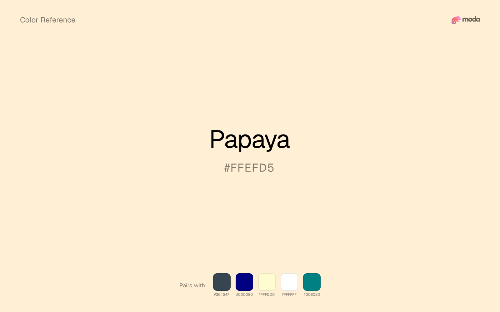
What colors go with papaya
Charcoal gives papaya the dark frame it is missing, so pale surfaces do not drift into a washed-out page.
Navy blue reins in papaya without deadening it, which is useful when you want warmth to stay present but not dominate every part of the page.
Cream lets papaya stay expressive without turning the whole composition stark; the result feels closer to editorial or packaging work than to raw UI default.
What colors clash with papaya
With papaya, Neon Green pushes the work toward novelty or screen-effect territory faster than most brand or editorial systems can tolerate.
Magenta pushes papaya toward a nightclub or cosmetic register that is hard to square with calmer editorial or product work.
With papaya, cyan introduces a colder display-driven cast that strips away some of the source color's tactile character.
Light Gray sits too close to papaya in value, so the palette can wash out before it ever establishes a clear hierarchy.
How should I use papaya in design?
- •Use papaya as a near-white alternative for backgrounds and paper-like surfaces where you want a hint of color without any visual weight.
- •Cool neutrals like charcoal and slate sharpen papaya's warm character, while warm companions like cream and gold amplify its inviting quality.
- •Light tones like papaya work best for card backgrounds, section tints, and gentle emphasis — they add color without competing with the content.
What are good papaya palettes?
Vivid clarity
Mobile app interfaces, onboarding screens, and light-mode UI themes.
Golden hour
Brand guidelines, design systems, and visual identity documents.
Design with papaya in Moda
Create a presentation or document using papayaas your accent color. Moda's AI applies your color palette automatically.
Create a design with papaya →What are the shades and tints of papaya?
Shades (darker)
Tints (lighter)
Tones (desaturated)
Hue variations
What are the color harmonies for papaya?
Harmonies are calculated from the base swatch. When a harmony matches a named color page, it links there; otherwise it appears here as a computed reference swatch.
Similar colors
Apricot
Apricot is almost the same hue as papaya; the real difference is value, with apricot feeling more grounded and anchor-ready.
Beige
Beige is useful when papaya is the right weight but the wrong mood: the swap changes temperature and finish more than contrast.
Peach
Peach stays very close to papaya in hue, but it lands darker, which makes it better for headlines, anchors, and darker sections than for lighter surfaces and more open applications.
Caramel
Caramel stays in the same color family as papaya, but the change in value moves it into different layout jobs, especially once backgrounds, charts, or section dividers enter the system.
Butter
Butter tracks close to papaya in hue, but the value shift changes where each one earns its place: butter is easier to use for headlines, anchors, and darker sections, while papaya holds onto lighter surfaces and more open applications.
Frequently asked questions
What is the hex code for papaya?
The hex code for papaya is #FFEFD5. In RGB, that's 255 red, 239 green, and 213 blue. The approximate CMYK equivalent is 0% cyan, 6% magenta, 16% yellow, and 0% key (black).
Is papaya a warm or cool color?
Papaya sits on the warm side of the palette, so it pairs easily with other warm tones and becomes more energetic when you place it against cooler blues or blue-grays.
Should papaya be used as a surface color or an accent?
Papaya belongs more naturally on surfaces than in tiny accent moments. Use it to open space, soften sections, or tint large areas, then let darker colors carry the emphasis.
Where does papaya work best in a layout?
Papaya is very light, so it works best as a background, card fill, or table tint in slides, documents, and landing pages. Pair it with dark text such as charcoal or navy for readability.
Is papaya accessible?
Papaya works better with dark text than white text. Black text reaches 18.56:1 contrast on the swatch, which makes the color more usable as a background or highlight surface than as a dark panel.
More orange colors
Keep exploring color resources
All color pages
Browse the full library of color references, pairings, and palettes.
Orange colors
Compare papaya with other orange tones.
Brown colors
Explore nearby color families to build stronger palettes and contrasts.
Neutral colors
Explore nearby color families to build stronger palettes and contrasts.
Red colors
Explore nearby color families to build stronger palettes and contrasts.
Last updated April 6, 2026
Color values are computed from the listed hex code using standard conversion formulas. RGB, HSL, and HSV are exact screen-ready conversions. CMYK is an approximate on-screen reference, not a press-ready print specification. Pairings, palettes, and use-case guidance are heuristic recommendations derived from color relationships, contrast behavior, and common presentation, document, and UI patterns.