Amber color guide
HEX
#FFBF00
RGB
255, 191, 0
HSL
45°, 100%, 50%
HSV
45°, 100%, 100%
Amber (#FFBF00) is the orange-yellow of fossilized resin and of "caution" lights — warm, directional, and easy to parse at a glance. It sits in a practical middle ground: not as aggressive as red, not as airy as lemon. Useful for status states, sunset palettes, and retro design alike.
Best for
Marketing websites, social media graphics, and campaign landing pages.
Accessibility
Check contrast before using amber for text-heavy layouts, especially on low-contrast backgrounds.
How does amber compare to nearby colors?
What color is amber?
The name comes from hardened tree resin valued as a gemstone. The same word labels the middle segment in many traffic signals and dashboard warning systems.
What is the hex code for amber?
| Format | Value |
|---|---|
| HEX | #FFBF00 |
| RGB | rgb(255, 191, 0) |
| HSL | hsl(45°, 100%, 50%) |
| HSV / HSB | hsv(45°, 100%, 100%) |
| CMYK (approx.) | cmyk(0%, 25%, 100%, 0%) |
Convert Amber to other color formats
Open the color converter with Amber (#FFBF00) prefilled to copy RGB, HSL, HSV, CMYK, or OKLCH values.
Convert Amber in the color converter →What does amber mean in design?
Amber may suggest pause, transition, or glowing heat. Versus saffron's more golden-yellow balance, amber usually feels more orange; versus honey, amber is often brighter and less brown.
How do I use amber in code?
| CSS (hex) | color: #FFBF00; |
| CSS (rgb) | color: rgb(255, 191, 0); |
| CSS (hsl) | color: hsl(45, 100%, 50%); |
| RGB % | rgb(100%, 75%, 0%) |
| Tailwind | text-[#FFBF00] |
| SwiftUI | Color(red: 1.000, green: 0.749, blue: 0.000) |
| UIKit | UIColor(red: 1.000, green: 0.749, blue: 0.000, alpha: 1.0) |
| Android | Color.rgb(255, 191, 0) |
| Compose | Color(0xFFFFBF00) |
| Web Safe | #FFCC00 |
Is amber accessible?
| Combination | Ratio | AA | AA lg | AAA | AAA lg | UI |
|---|---|---|---|---|---|---|
| AaWhite text on this color | 1.65:1 | ✗ | ✗ | ✗ | ✗ | ✗ |
| AaBlack text on this color | 12.7:1 | ✓ | ✓ | ✓ | ✓ | ✓ |
| AaThis color as text on white | 1.65:1 | ✗ | ✗ | ✗ | ✗ | ✗ |
| AaThis color as text on black | 12.7:1 | ✓ | ✓ | ✓ | ✓ | ✓ |
WCAG 2.1: AA normal ≥ 4.5:1, AA large text ≥ 3:1, AAA normal ≥ 7:1, AAA large ≥ 4.5:1, UI components ≥ 3:1.
How does amber look with color blindness?
Simulated appearance for common types of color vision deficiency. Actual perception varies by individual.
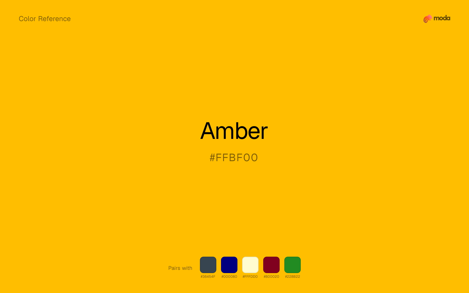
What colors go with amber
When amber is already bright, charcoal absorbs some of the visual heat and keeps the combination closer to alerts, signage, and data callouts than to novelty graphics.
Navy blue helps amber read less like raw signal color and more like part of a complete palette.
Cream takes the hard digital edge off amber and makes the color feel more printed, paper-backed, and approachable.
Burgundy changes how amber comes across: more premium retail and sport in mood, and less likely to feel isolated or unfinished.
Forest Green changes how amber comes across: more finance, outdoors, and institutional systems in mood, and less likely to feel isolated or unfinished.
What colors clash with amber
Neon Green competes with amber so aggressively that the palette never really settles into a clear primary-secondary relationship.
Magenta remaps amber too aggressively, dragging it away from alerts, signage, and data callouts and into a brighter, more performative palette.
With amber, cyan introduces a colder display-driven cast that strips away some of the source color's tactile character.
Light Gray makes amber feel softer, but often softer in the wrong way: less defined, not more refined.
How should I use amber in design?
- •Use amber where you need a clear, ownable color — logos, primary CTAs, and hero sections where it carries the visual identity.
- •Pair amber with cool accents (navy, sage, steel blue) for sharp contrast, or keep it with other warm tones (cream, gold, tan) for a cohesive, editorial feel.
- •Vivid colors like amber work best as punctuation in a layout: CTAs, key metrics, or a single hero element. Surrounding neutrals keep it from fatiguing the viewer.
What are good amber palettes?
Design with amber in Moda
Create a presentation or document using amberas your accent color. Moda's AI applies your color palette automatically.
Create a design with amber →What are the shades and tints of amber?
Shades (darker)
Tints (lighter)
Tones (desaturated)
Hue variations
What are the color harmonies for amber?
Harmonies are calculated from the base swatch. When a harmony matches a named color page, it links there; otherwise it appears here as a computed reference swatch.
Similar colors
Gold
Gold is near enough to amber to swap into the same palette, yet the undertone shift still decides whether the family reads warmer or cooler overall.
Orange
Orange lives in the same neighborhood as amber, but the finish shift is enough to make one feel better for food, promotion, and social-first graphics and the other for alerts, signage, and data callouts.
Saffron
Saffron is almost the same hue as amber; the real difference is value, with saffron feeling more open and surface-friendly.
Honey
Honey is near enough to amber to swap into the same palette, yet the undertone shift still decides whether the family reads warmer or cooler overall.
Canary
Canary lives in the same neighborhood as amber, but the finish shift is enough to make one feel better for alerts, signage, and data callouts and the other for a different visual context.
Frequently asked questions
What is the hex code for amber?
The hex code for amber is #FFBF00. In RGB, that's 255 red, 191 green, and 0 blue. The approximate CMYK equivalent is 0% cyan, 25% magenta, 100% yellow, and 0% key (black).
Is amber a warm or cool color?
Amber reads as warm. It feels most natural with creams, golds, rusts, and other warm accents, while cooler partners like navy or teal create sharper contrast.
Is amber better as an accent or a full-palette color?
Amber is usually best when it leads in short bursts rather than covering everything. It can headline a palette, but most layouts work better when the color handles accents, highlights, or one main hero role instead of every surface.
How should I use amber in a design?
Amber is vivid enough to work best in controlled doses such as CTAs, highlighted metrics, chart accents, or a single hero element. Surround it with quieter neutrals so it does not exhaust the layout.
Can I use amber for text or backgrounds?
Amber works better with dark text than white text. Black text reaches 12.7:1 contrast on the swatch, which makes the color more usable as a background or highlight surface than as a dark panel.
More yellow colors
Keep exploring color resources
All color pages
Browse the full library of color references, pairings, and palettes.
Yellow colors
Compare amber with other yellow tones.
Brown colors
Explore nearby color families to build stronger palettes and contrasts.
Green colors
Explore nearby color families to build stronger palettes and contrasts.
Neutral colors
Explore nearby color families to build stronger palettes and contrasts.
Last updated April 6, 2026
Color values are computed from the listed hex code using standard conversion formulas. RGB, HSL, and HSV are exact screen-ready conversions. CMYK is an approximate on-screen reference, not a press-ready print specification. Pairings, palettes, and use-case guidance are heuristic recommendations derived from color relationships, contrast behavior, and common presentation, document, and UI patterns.