Saffron palettes and pairings
HEX
#F4C430
RGB
244, 196, 48
HSL
45°, 90%, 57%
HSV
45°, 80%, 96%
Saffron (#F4C430) reads as a spiced, golden yellow with a clear orange lean — think threads steeping in rice rather than a highlighter stripe. It carries depth enough for premium cues while still scanning unmistakably as yellow. It bridges food, craft, and ceremonial aesthetics without the heavy brown of goldenrod.
Best for
Event branding, newsletters, and customer-facing web pages.
Accessibility
Check contrast before using saffron for text-heavy layouts, especially on low-contrast backgrounds.
How does saffron compare to nearby colors?
What is the difference between saffron and goldenrod?
Saffron (#F4C430) and Goldenrod (#DAA520) may look neighboring at first glance, yet their surface character diverges once they sit next to whites, charcoals, and other real layout neutrals. Saffron makes the composition feel less compact, which is useful when the darker alternative starts to dominate too early. Choose saffron when the surrounding system aligns better with alerts, signage, and data callouts, and move to goldenrod when the stronger contextual fit is consumer accents and upbeat brand systems.
What color is saffron?
Named for Crocus sativus stigmas used as seasoning and dye. Culturally prominent in South Asian textiles, religious dress, and culinary photography where turmeric- and saffron-toned golds signal warmth and tradition.
What is the hex code for saffron?
| Format | Value |
|---|---|
| HEX | #F4C430 |
| RGB | rgb(244, 196, 48) |
| HSL | hsl(45°, 90%, 57%) |
| HSV / HSB | hsv(45°, 80%, 96%) |
| CMYK (approx.) | cmyk(0%, 20%, 80%, 4%) |
Convert Saffron to other color formats
Open the color converter with Saffron (#F4C430) prefilled to copy RGB, HSL, HSV, CMYK, or OKLCH values.
Convert Saffron in the color converter →What does saffron mean in design?
Saffron can carry associations with festivity, hospitality, or sacred contexts, but they are not automatic for every audience. Next to amber or honey, saffron stays more yellow and less traffic-light; next to maize or butter, it feels richer and more adult.
How do I use saffron in code?
| CSS (hex) | color: #F4C430; |
| CSS (rgb) | color: rgb(244, 196, 48); |
| CSS (hsl) | color: hsl(45, 90%, 57%); |
| RGB % | rgb(96%, 77%, 19%) |
| Tailwind | text-[#F4C430] |
| SwiftUI | Color(red: 0.957, green: 0.769, blue: 0.188) |
| UIKit | UIColor(red: 0.957, green: 0.769, blue: 0.188, alpha: 1.0) |
| Android | Color.rgb(244, 196, 48) |
| Compose | Color(0xFFF4C430) |
| Web Safe | #FFCC33 |
Is saffron accessible?
| Combination | Ratio | AA | AA lg | AAA | AAA lg | UI |
|---|---|---|---|---|---|---|
| AaWhite text on this color | 1.64:1 | ✗ | ✗ | ✗ | ✗ | ✗ |
| AaBlack text on this color | 12.79:1 | ✓ | ✓ | ✓ | ✓ | ✓ |
| AaThis color as text on white | 1.64:1 | ✗ | ✗ | ✗ | ✗ | ✗ |
| AaThis color as text on black | 12.79:1 | ✓ | ✓ | ✓ | ✓ | ✓ |
WCAG 2.1: AA normal ≥ 4.5:1, AA large text ≥ 3:1, AAA normal ≥ 7:1, AAA large ≥ 4.5:1, UI components ≥ 3:1.
How does saffron look with color blindness?
Simulated appearance for common types of color vision deficiency. Actual perception varies by individual.
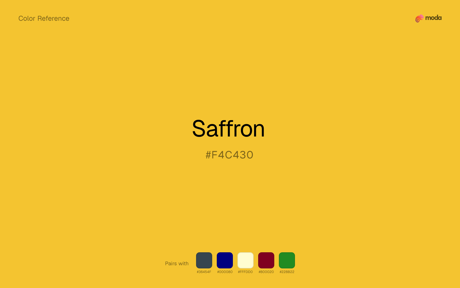
What colors go with saffron
When saffron is already bright, charcoal absorbs some of the visual heat and keeps the combination closer to alerts, signage, and data callouts than to novelty graphics.
Navy blue reins in saffron without deadening it, which is useful when you want warmth to stay present but not dominate every part of the page.
Cream takes the hard digital edge off saffron and makes the color feel more printed, paper-backed, and approachable.
Burgundy helps saffron feel more complete in practice because the pairing combines highlighter-bright qualities with lacquered and formal support instead of leaving the source color to do every job alone.
Forest Green brings a different temperature cue than saffron, which helps the palette feel more layered and less one-note.
What colors clash with saffron
Neon Green competes with saffron so aggressively that the palette never really settles into a clear primary-secondary relationship.
With saffron, magenta introduces a second emotional story instead of reinforcing the first one, so the palette can feel internally split.
Cyan redirects saffron toward a more technical, backlit interpretation, which is risky when the goal is warmth, polish, or print-minded editorial work.
Light Gray makes saffron feel softer, but often softer in the wrong way: less defined, not more refined.
How should I use saffron in design?
- •Saffron has the saturation to lead a brand palette — strong enough for buttons, headers, and packaging without drifting into pastel or dark territory.
- •Pair saffron with cool accents (navy, sage, steel blue) for sharp contrast, or keep it with other warm tones (cream, gold, tan) for a cohesive, editorial feel.
- •Vivid colors like saffron work best as punctuation in a layout: CTAs, key metrics, or a single hero element. Surrounding neutrals keep it from fatiguing the viewer.
What are good saffron palettes?
Soft landing
Startup branding, pitch materials, and product landing pages.
Design with saffron in Moda
Create a presentation or document using saffronas your accent color. Moda's AI applies your color palette automatically.
Create a design with saffron →What are the shades and tints of saffron?
Shades (darker)
Tints (lighter)
Tones (desaturated)
Hue variations
What are the color harmonies for saffron?
Harmonies are calculated from the base swatch. When a harmony matches a named color page, it links there; otherwise it appears here as a computed reference swatch.
Similar colors
Dandelion
Dandelion is near enough to saffron to swap into the same palette, yet the undertone shift still decides whether the family reads warmer or cooler overall.
Amber
Amber is almost the same hue as saffron; the real difference is value, with amber feeling more grounded and anchor-ready.
Goldenrod
Goldenrod stays very close to saffron in hue, but it lands darker, which makes it better for headlines, anchors, and darker sections than for lighter surfaces and more open applications.
Mustard Yellow
Mustard Yellow stays very close to saffron in hue, but it lands lighter, which makes it better for backgrounds, tints, and softer supporting areas than for accents, stronger hierarchy, and firmer structure.
Gold
Gold stays very close to saffron in hue, but it lands darker, which makes it better for headlines, anchors, and darker sections than for lighter surfaces and more open applications.
Frequently asked questions
What is the hex code for saffron?
The hex code for saffron is #F4C430. In RGB, that's 244 red, 196 green, and 48 blue. The approximate CMYK equivalent is 0% cyan, 20% magenta, 80% yellow, and 4% key (black).
Is saffron a warm or cool color?
Saffron reads as warm. It feels most natural with creams, golds, rusts, and other warm accents, while cooler partners like navy or teal create sharper contrast.
Is saffron better as an accent or a full-palette color?
Saffron is usually best when it leads in short bursts rather than covering everything. It can headline a palette, but most layouts work better when the color handles accents, highlights, or one main hero role instead of every surface.
How should I use saffron in a design?
Saffron is vivid enough to work best in controlled doses such as CTAs, highlighted metrics, chart accents, or a single hero element. Surround it with quieter neutrals so it does not exhaust the layout.
Can I use saffron for text or backgrounds?
Saffron works better with dark text than white text. Black text reaches 12.79:1 contrast on the swatch, which makes the color more usable as a background or highlight surface than as a dark panel.
More yellow colors
Keep exploring color resources
All color pages
Browse the full library of color references, pairings, and palettes.
Yellow colors
Compare saffron with other yellow tones.
Brown colors
Explore nearby color families to build stronger palettes and contrasts.
Green colors
Explore nearby color families to build stronger palettes and contrasts.
Neutral colors
Explore nearby color families to build stronger palettes and contrasts.
Last updated April 6, 2026
Color values are computed from the listed hex code using standard conversion formulas. RGB, HSL, and HSV are exact screen-ready conversions. CMYK is an approximate on-screen reference, not a press-ready print specification. Pairings, palettes, and use-case guidance are heuristic recommendations derived from color relationships, contrast behavior, and common presentation, document, and UI patterns.