Carnation palettes and pairings
HEX
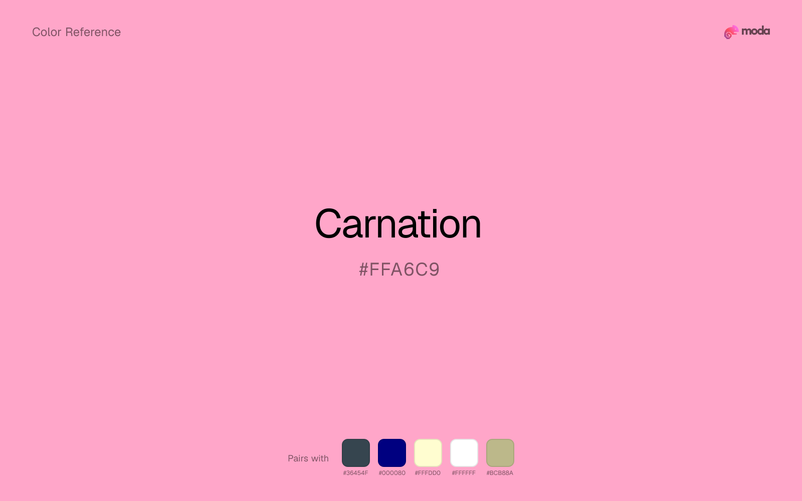
#FFA6C9
RGB
255, 166, 201
HSL
336°, 100%, 83%
HSV
336°, 35%, 100%
Florist pink — medium-light, a little powdery, and comfortably "pretty" without neon. #FFA6C9 carries the etiquette of bouquets, sentiment packaged neatly. It is the pink people pick when they want romance that still feels traditional.
Best for
Event branding, newsletters, and customer-facing web pages.
Accessibility
Check contrast before using carnation for text-heavy layouts, especially on low-contrast backgrounds.
How does carnation compare to nearby colors?
What color is carnation?
Named after the carnation flower. Common in floral branding, Mother's Day graphics, prom aesthetics, and classic feminine packaging.
What is the hex code for carnation?
| Format | Value |
|---|---|
| HEX | #FFA6C9 |
| RGB | rgb(255, 166, 201) |
| HSL | hsl(336°, 100%, 83%) |
| HSV / HSB | hsv(336°, 35%, 100%) |
| CMYK (approx.) | cmyk(0%, 35%, 21%, 0%) |
Convert Carnation to other color formats
Open the color converter with Carnation (#FFA6C9) prefilled to copy RGB, HSL, HSV, CMYK, or OKLCH values.
Convert Carnation in the color converter →What does carnation mean in design?
Carnation is often associated with affection, gratitude, and gentle celebration. Versus flamingo it can feel slightly cooler and more "bouquet"; versus pastel pink it is deeper and more legible as a fill.
How do I use carnation in code?
| CSS (hex) | color: #FFA6C9; |
| CSS (rgb) | color: rgb(255, 166, 201); |
| CSS (hsl) | color: hsl(336, 100%, 83%); |
| RGB % | rgb(100%, 65%, 79%) |
| Tailwind | text-[#FFA6C9] |
| SwiftUI | Color(red: 1.000, green: 0.651, blue: 0.788) |
| UIKit | UIColor(red: 1.000, green: 0.651, blue: 0.788, alpha: 1.0) |
| Android | Color.rgb(255, 166, 201) |
| Compose | Color(0xFFFFA6C9) |
| Web Safe | #FF99CC |
Is carnation accessible?
| Combination | Ratio | AA | AA lg | AAA | AAA lg | UI |
|---|---|---|---|---|---|---|
| AaWhite text on this color | 1.82:1 | ✗ | ✗ | ✗ | ✗ | ✗ |
| AaBlack text on this color | 11.55:1 | ✓ | ✓ | ✓ | ✓ | ✓ |
| AaThis color as text on white | 1.82:1 | ✗ | ✗ | ✗ | ✗ | ✗ |
| AaThis color as text on black | 11.55:1 | ✓ | ✓ | ✓ | ✓ | ✓ |
WCAG 2.1: AA normal ≥ 4.5:1, AA large text ≥ 3:1, AAA normal ≥ 7:1, AAA large ≥ 4.5:1, UI components ≥ 3:1.
How does carnation look with color blindness?
Simulated appearance for common types of color vision deficiency. Actual perception varies by individual.
What colors go with carnation
Charcoal gives carnation the dark frame it is missing, so pale surfaces do not drift into a washed-out page.
Beside carnation, navy blue shifts the palette away from novelty sweetness and toward something more composed.
Cream lets carnation stay expressive without turning the whole composition stark; the result feels closer to editorial or packaging work than to raw UI default.
With a bright color like carnation, white acts like clean paper around the swatch and prevents the palette from feeling packed too tightly.
Sage Green changes how carnation comes across: more wellness, botanical, and lifestyle palettes in mood, and less likely to feel isolated or unfinished.
What colors clash with carnation
Neon Green competes with carnation so aggressively that the palette never really settles into a clear primary-secondary relationship.
With carnation, magenta introduces a second emotional story instead of reinforcing the first one, so the palette can feel internally split.
With carnation, cyan introduces a colder display-driven cast that strips away some of the source color's tactile character.
Light Gray sits too close to carnation in value, so the palette can wash out before it ever establishes a clear hierarchy.
How should I use carnation in design?
- •Carnation works best as a background tint, card fill, or section divider — it adds warmth without competing with foreground content. Pair with dark text for readability.
- •Carnation leans warm, so cool counterparts like navy, teal, or slate create the cleanest contrast. For a softer, tonal look, stay within neighboring warm hues and let value differences do the work.
- •Carnation's lightness makes it a good candidate for email backgrounds, slide canvases, and page sections where you want atmosphere, not distraction.
What are good carnation palettes?
Fireside
Brand guidelines, design systems, and visual identity documents.
Design with carnation in Moda
Create a presentation or document using carnationas your accent color. Moda's AI applies your color palette automatically.
Create a design with carnation →What are the shades and tints of carnation?
Shades (darker)
Tints (lighter)
Tones (desaturated)
Hue variations
What are the color harmonies for carnation?
Harmonies are calculated from the base swatch. When a harmony matches a named color page, it links there; otherwise it appears here as a computed reference swatch.
Similar colors
Blush
Blush sits close to carnation in hue, but its red-hot cast changes the mood of the palette even when the contrast shift is small.
Bubblegum
Bubblegum sits close to carnation in hue, but its red-hot cast changes the mood of the palette even when the contrast shift is small.
Pink
Pink lives in the same neighborhood as carnation, but the finish shift is enough to make one feel better for beauty packaging, weddings, and soft UI and the other for a different visual context.
Flamingo
Flamingo is almost the same hue as carnation; the real difference is value, with flamingo feeling more grounded and anchor-ready.
Salmon Pink
Salmon Pink sits close to carnation in hue, but its red-hot cast changes the mood of the palette even when the contrast shift is small.
Frequently asked questions
What is the hex code for carnation?
The hex code for carnation is #FFA6C9. In RGB, that's 255 red, 166 green, and 201 blue. The approximate CMYK equivalent is 0% cyan, 35% magenta, 21% yellow, and 0% key (black).
Is carnation a warm or cool color?
Carnation reads as warm. It feels most natural with creams, golds, rusts, and other warm accents, while cooler partners like navy or teal create sharper contrast.
Is carnation better for backgrounds or accents?
Carnation is usually stronger as a background, card tint, or section surface than as a sharp accent. It works best when darker typography or controls can sit on top and do the hierarchy work.
How should I use carnation in a design?
Carnation is light enough that it belongs on surfaces rather than in small text. Use it for backgrounds, soft section breaks, or gentle table shading and keep dark typography on top.
Can I use carnation for text or backgrounds?
Carnation works better with dark text than white text. Black text reaches 11.55:1 contrast on the swatch, which makes the color more usable as a background or highlight surface than as a dark panel.
More pink colors
Keep exploring color resources
All color pages
Browse the full library of color references, pairings, and palettes.
Pink colors
Compare carnation with other pink tones.
Neutral colors
Explore nearby color families to build stronger palettes and contrasts.
Orange colors
Explore nearby color families to build stronger palettes and contrasts.
Purple colors
Explore nearby color families to build stronger palettes and contrasts.
Last updated April 6, 2026
Color values are computed from the listed hex code using standard conversion formulas. RGB, HSL, and HSV are exact screen-ready conversions. CMYK is an approximate on-screen reference, not a press-ready print specification. Pairings, palettes, and use-case guidance are heuristic recommendations derived from color relationships, contrast behavior, and common presentation, document, and UI patterns.