What color is Bronze?
HEX
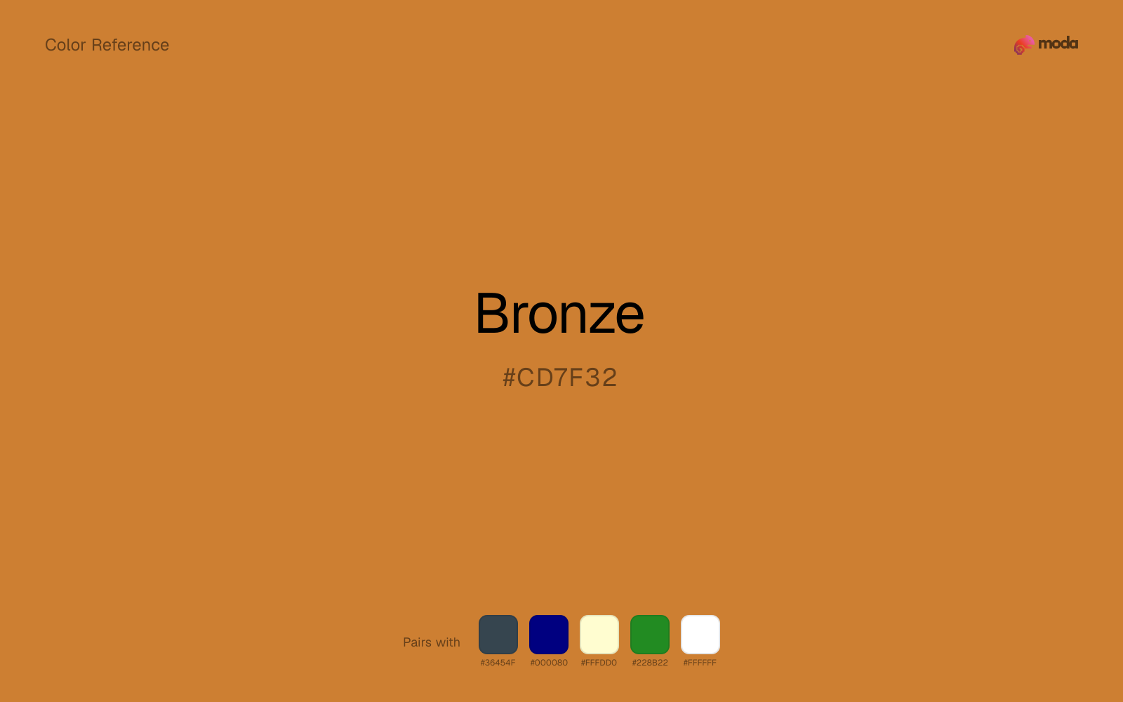
#CD7F32
RGB
205, 127, 50
HSL
30°, 61%, 50%
HSV
30°, 76%, 80%
Copper's patience shows through bronze — warm, slightly burnt, quietly ancient. #CD7F32 carries the memory of statues, ship fittings, and medals that darken with time. Celebratory, but with gravity rather than glitter.
Best for
Trade show graphics, signage, and booth displays.
Accessibility
Check contrast before using bronze for text-heavy layouts, especially on low-contrast backgrounds.
How does bronze compare to nearby colors?
What is the difference between bronze and goldenrod?
The visible difference between Bronze (#CD7F32) and Goldenrod (#DAA520) is subtle, but it still nudges the family from foil warmth toward sunlit and optimistic. Bronze and Goldenrod can fill many of the same slots, but one steers the palette toward foil warmth and the other toward sunlit and optimistic. Start with bronze when the palette wants more foil warmth; switch to goldenrod when the better fit is sunlit and optimistic.
What color is bronze?
Bronze is a copper-tin alloy central to sculpture, tools, and Olympic podium medals. In design, "bronze" often signals a darker, ruddier metallic than brass.
What is the hex code for bronze?
| Format | Value |
|---|---|
| HEX | #CD7F32 |
| RGB | rgb(205, 127, 50) |
| HSL | hsl(30°, 61%, 50%) |
| HSV / HSB | hsv(30°, 76%, 80%) |
| CMYK (approx.) | cmyk(0%, 38%, 76%, 20%) |
Convert Bronze to other color formats
Open the color converter with Bronze (#CD7F32) prefilled to copy RGB, HSL, HSV, CMYK, or OKLCH values.
Convert Bronze in the color converter →What does bronze mean in design?
Bronze is often associated with endurance, craftsmanship, and third-place recognition. It reads as deeper and more copper-brown than brass, and less opulent than gold metallic.
How do I use bronze in code?
| CSS (hex) | color: #CD7F32; |
| CSS (rgb) | color: rgb(205, 127, 50); |
| CSS (hsl) | color: hsl(30, 61%, 50%); |
| RGB % | rgb(80%, 50%, 20%) |
| Tailwind | text-[#CD7F32] |
| SwiftUI | Color(red: 0.804, green: 0.498, blue: 0.196) |
| UIKit | UIColor(red: 0.804, green: 0.498, blue: 0.196, alpha: 1.0) |
| Android | Color.rgb(205, 127, 50) |
| Compose | Color(0xFFCD7F32) |
| Web Safe | #CC6633 |
Is bronze accessible?
| Combination | Ratio | AA | AA lg | AAA | AAA lg | UI |
|---|---|---|---|---|---|---|
| AaWhite text on this color | 3.14:1 | ✗ | ✓ | ✗ | ✗ | ✓ |
| AaBlack text on this color | 6.68:1 | ✓ | ✓ | ✗ | ✓ | ✓ |
| AaThis color as text on white | 3.14:1 | ✗ | ✓ | ✗ | ✗ | ✓ |
| AaThis color as text on black | 6.68:1 | ✓ | ✓ | ✗ | ✓ | ✓ |
WCAG 2.1: AA normal ≥ 4.5:1, AA large text ≥ 3:1, AAA normal ≥ 7:1, AAA large ≥ 4.5:1, UI components ≥ 3:1.
How does bronze look with color blindness?
Simulated appearance for common types of color vision deficiency. Actual perception varies by individual.
What colors go with bronze
Charcoal helps bronze feel grounded and architectural, especially when the design needs a darker value that still reads refined.
With bronze, navy blue adds enough gravity that the palette reads as ceremonial or premium rather than decorative-only.
Cream helps bronze read warmer, softer, and less screen-hard than it would beside pure white.
Forest Green gives bronze a second note that is different enough to feel intentional but not so different that the palette loses coherence.
What colors clash with bronze
Neon Green changes the meaning of bronze too abruptly, replacing the source color's premium packaging and celebratory branding cues with something much louder and less stable.
Magenta pushes bronze toward a nightclub or cosmetic register that is hard to square with calmer editorial or product work.
Cyan redirects bronze toward a more technical, backlit interpretation, which is risky when the goal is warmth, polish, or print-minded editorial work.
Pastel Pink can undercut bronze's authority by turning the combination more decorative than decisive.
How should I use bronze in design?
- •Use bronze where you need a clear, ownable color — logos, primary CTAs, and hero sections where it carries the visual identity.
- •Cool neutrals like charcoal and slate sharpen bronze's warm character, while warm companions like cream and gold amplify its inviting quality.
- •Bronze works best as a detail accent — foil stamps, rule lines, badge fills, and typographic highlights rather than large surface coverage.
What are good bronze palettes?
Design with bronze in Moda
Create a presentation or document using bronzeas your accent color. Moda's AI applies your color palette automatically.
Create a design with bronze →What are the shades and tints of bronze?
Shades (darker)
Tints (lighter)
Tones (desaturated)
Hue variations
What are the color harmonies for bronze?
Harmonies are calculated from the base swatch. When a harmony matches a named color page, it links there; otherwise it appears here as a computed reference swatch.
Similar colors
Gold Metallic
Gold Metallic is near enough to bronze to swap into the same palette, yet the undertone shift still decides whether the family reads warmer or cooler overall.
Goldenrod
Goldenrod is nearly adjacent to bronze in hue; what separates them is intensity, with goldenrod reading cleaner and more assertive.
Brass
Brass keeps roughly the same visual weight as bronze but changes the undertone story, which is often enough to move a palette from warmer and tactile to cooler and more technical, or the reverse.
Honey
Honey sits close to bronze on the wheel, but it carries more pigment pressure, which makes it better for faster emphasis and brighter accent work than for broader coverage and quieter supporting roles.
Sienna
Sienna is almost the same hue as bronze; the real difference is value, with sienna feeling more grounded and anchor-ready.
Frequently asked questions
What is the hex code for bronze?
The hex code for bronze is #CD7F32. In RGB, that's 205 red, 127 green, and 50 blue. The approximate CMYK equivalent is 0% cyan, 38% magenta, 76% yellow, and 20% key (black).
Is bronze a warm or cool color?
Bronze sits on the warm side of the palette, so it pairs easily with other warm tones and becomes more energetic when you place it against cooler blues or blue-grays.
Is bronze better for accents, structure, or surfaces?
Bronze sits in the usable middle: strong enough to anchor a section or call attention to a key moment, but calm enough to support a broader system when the surrounding values are well managed.
Where does bronze work best in a layout?
Bronze sits in the middle of the spectrum in a useful way: strong enough for emphasis, but controlled enough to support a broader brand or presentation system when the contrast is handled well.
Is bronze accessible?
Bronze works better with dark text than white text. Black text reaches 6.68:1 contrast on the swatch, which makes the color more usable as a background or highlight surface than as a dark panel.
More metallic colors
Keep exploring color resources
All color pages
Browse the full library of color references, pairings, and palettes.
Metallic colors
Compare bronze with other metallic tones.
Brown colors
Explore nearby color families to build stronger palettes and contrasts.
Neutral colors
Explore nearby color families to build stronger palettes and contrasts.
Orange colors
Explore nearby color families to build stronger palettes and contrasts.
Last updated April 6, 2026
Color values are computed from the listed hex code using standard conversion formulas. RGB, HSL, and HSV are exact screen-ready conversions. CMYK is an approximate on-screen reference, not a press-ready print specification. Pairings, palettes, and use-case guidance are heuristic recommendations derived from color relationships, contrast behavior, and common presentation, document, and UI patterns.