What color is Gold Metallic?
HEX
#D4AF37
RGB
212, 175, 55
HSL
46°, 65%, 52%
HSV
46°, 74%, 83%
Sunlight caught in foil — rich, assertive, and immediately celebratory. #D4AF37 reads as currency and ceremony before it reads as "yellow." A little goes a long way: even small accents feel like intentional luxury.
Best for
Educational platforms, course materials, and infographic designs.
Compare with
Accessibility
Check contrast before using gold metallic for text-heavy layouts, especially on low-contrast backgrounds.
How does gold metallic compare to nearby colors?
What is the difference between gold metallic and saffron?
Gold Metallic (#D4AF37) looks dustier and more restrained than Saffron (#F4C430) when the two are shown together. Gold Metallic behaves more like a system color and Saffron more like a spotlight, so the decision changes how busy the layout feels. Start with gold metallic when the palette wants more foil warmth; switch to saffron when the better fit is highlighter-bright.
What color is gold metallic?
Metallic gold appears across awards, medals, religious art, packaging foils, and high-end print finishes. Widely used in branding to signal premium tiers and commemorative editions.
What is the hex code for gold metallic?
| Format | Value |
|---|---|
| HEX | #D4AF37 |
| RGB | rgb(212, 175, 55) |
| HSL | hsl(46°, 65%, 52%) |
| HSV / HSB | hsv(46°, 74%, 83%) |
| CMYK (approx.) | cmyk(0%, 17%, 74%, 17%) |
Convert Gold Metallic to other color formats
Open the color converter with Gold Metallic (#D4AF37) prefilled to copy RGB, HSL, HSV, CMYK, or OKLCH values.
Convert Gold Metallic in the color converter →What does gold metallic mean in design?
Gold metallic is often associated with achievement, prosperity, and festive grandeur. It reads as bolder and more traditional than champagne gold, and more "precious metal" than brass.
How do I use gold metallic in code?
| CSS (hex) | color: #D4AF37; |
| CSS (rgb) | color: rgb(212, 175, 55); |
| CSS (hsl) | color: hsl(46, 65%, 52%); |
| RGB % | rgb(83%, 69%, 22%) |
| Tailwind | text-[#D4AF37] |
| SwiftUI | Color(red: 0.831, green: 0.686, blue: 0.216) |
| UIKit | UIColor(red: 0.831, green: 0.686, blue: 0.216, alpha: 1.0) |
| Android | Color.rgb(212, 175, 55) |
| Compose | Color(0xFFD4AF37) |
| Web Safe | #CC9933 |
Is gold metallic accessible?
| Combination | Ratio | AA | AA lg | AAA | AAA lg | UI |
|---|---|---|---|---|---|---|
| AaWhite text on this color | 2.1:1 | ✗ | ✗ | ✗ | ✗ | ✗ |
| AaBlack text on this color | 9.99:1 | ✓ | ✓ | ✓ | ✓ | ✓ |
| AaThis color as text on white | 2.1:1 | ✗ | ✗ | ✗ | ✗ | ✗ |
| AaThis color as text on black | 9.99:1 | ✓ | ✓ | ✓ | ✓ | ✓ |
WCAG 2.1: AA normal ≥ 4.5:1, AA large text ≥ 3:1, AAA normal ≥ 7:1, AAA large ≥ 4.5:1, UI components ≥ 3:1.
How does gold metallic look with color blindness?
Simulated appearance for common types of color vision deficiency. Actual perception varies by individual.
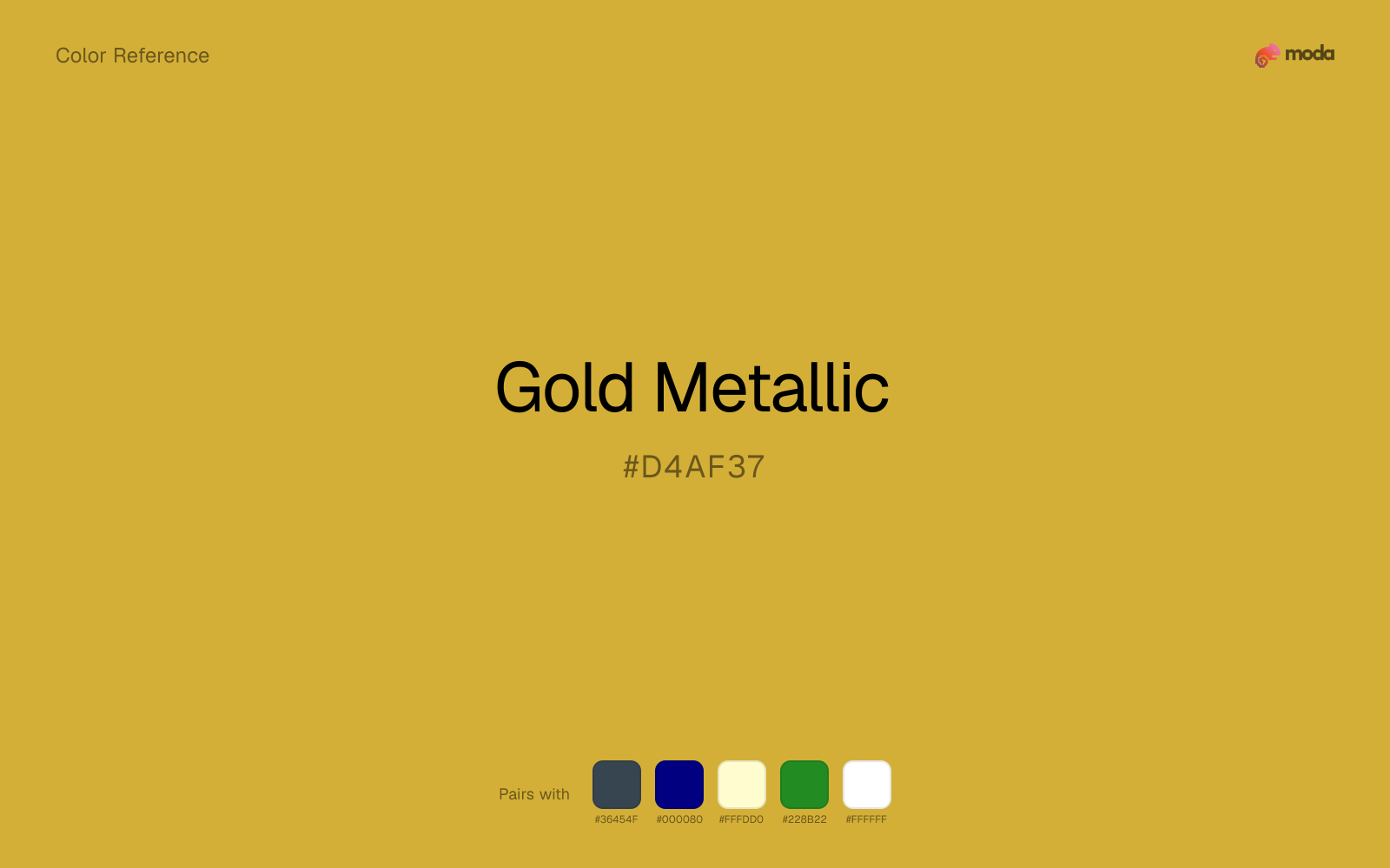
What colors go with gold metallic
Charcoal helps gold metallic feel grounded and architectural, especially when the design needs a darker value that still reads refined.
Navy blue steadies gold metallic and gives the metallic accent a stronger setting than white alone would.
Cream gives gold metallic a quieter backdrop and preserves a more natural editorial feel than a colder off-white would.
Forest Green changes how gold metallic comes across: more finance, outdoors, and institutional systems in mood, and less likely to feel isolated or unfinished.
What colors clash with gold metallic
With gold metallic, Neon Green pushes the work toward novelty or screen-effect territory faster than most brand or editorial systems can tolerate.
Magenta pushes gold metallic toward a nightclub or cosmetic register that is hard to square with calmer editorial or product work.
With gold metallic, cyan introduces a colder display-driven cast that strips away some of the source color's tactile character.
With gold metallic, Pastel Pink often steers the system toward nursery or confectionery cues instead of the more grounded mood the source color supports.
How should I use gold metallic in design?
- •Use gold metallic where you need a clear, ownable color — logos, primary CTAs, and hero sections where it carries the visual identity.
- •Gold Metallic leans warm, so cool counterparts like navy, teal, or slate create the cleanest contrast. For a softer, tonal look, stay within neighboring warm hues and let value differences do the work.
- •Gold Metallic works best as a detail accent — foil stamps, rule lines, badge fills, and typographic highlights rather than large surface coverage.
What are good gold metallic palettes?
Light touch
Educational platforms, course materials, and infographic designs.
Warm hearth
Brand guidelines, design systems, and visual identity documents.
Design with gold metallic in Moda
Create a presentation or document using gold metallicas your accent color. Moda's AI applies your color palette automatically.
Create a design with gold metallic →What are the shades and tints of gold metallic?
Shades (darker)
Tints (lighter)
Tones (desaturated)
Hue variations
What are the color harmonies for gold metallic?
Harmonies are calculated from the base swatch. When a harmony matches a named color page, it links there; otherwise it appears here as a computed reference swatch.
Similar colors
Goldenrod
Goldenrod sits close to gold metallic on the wheel, but it carries more pigment pressure, which makes it better for faster emphasis and brighter accent work than for broader coverage and quieter supporting roles.
Brass
Brass is nearly adjacent to gold metallic in hue; what separates them is intensity, with brass reading dustier and easier to extend across a layout.
Saffron
Saffron is nearly adjacent to gold metallic in hue; what separates them is intensity, with saffron reading cleaner and more assertive.
Bronze
Bronze lives in the same neighborhood as gold metallic, but the finish shift is enough to make one feel better for premium packaging and celebratory branding and the other for a different visual context.
Dandelion
Dandelion sits close to gold metallic on the wheel, but it carries more pigment pressure, which makes it better for faster emphasis and brighter accent work than for broader coverage and quieter supporting roles.
Frequently asked questions
What is the hex code for gold metallic?
The hex code for gold metallic is #D4AF37. In RGB, that's 212 red, 175 green, and 55 blue. The approximate CMYK equivalent is 0% cyan, 17% magenta, 74% yellow, and 17% key (black).
Is gold metallic a warm or cool color?
Gold Metallic reads as warm. It feels most natural with creams, golds, rusts, and other warm accents, while cooler partners like navy or teal create sharper contrast.
Where does gold metallic work best in a layout?
Gold Metallic is flexible enough to move between accents, section blocks, and supporting roles depending on the contrast around it. It works best when the rest of the palette gives it a clear job instead of asking it to do everything at once.
How should I use gold metallic in a design?
Gold Metallic is versatile enough for headlines, accent bars, buttons, charts, or section backgrounds depending on the contrast around it. It works as either a primary or supporting color in decks, documents, and brand systems.
Can I use gold metallic for text or backgrounds?
Gold Metallic works better with dark text than white text. Black text reaches 9.99:1 contrast on the swatch, which makes the color more usable as a background or highlight surface than as a dark panel.
More metallic colors
See all metallic colors →Keep exploring color resources
All color pages
Browse the full library of color references, pairings, and palettes.
Metallic colors
Compare gold metallic with other metallic tones.
Brown colors
Explore nearby color families to build stronger palettes and contrasts.
Neutral colors
Explore nearby color families to build stronger palettes and contrasts.
Orange colors
Explore nearby color families to build stronger palettes and contrasts.
Last updated April 6, 2026
Color values are computed from the listed hex code using standard conversion formulas. RGB, HSL, and HSV are exact screen-ready conversions. CMYK is an approximate on-screen reference, not a press-ready print specification. Pairings, palettes, and use-case guidance are heuristic recommendations derived from color relationships, contrast behavior, and common presentation, document, and UI patterns.