What color is Silver Metallic?
HEX
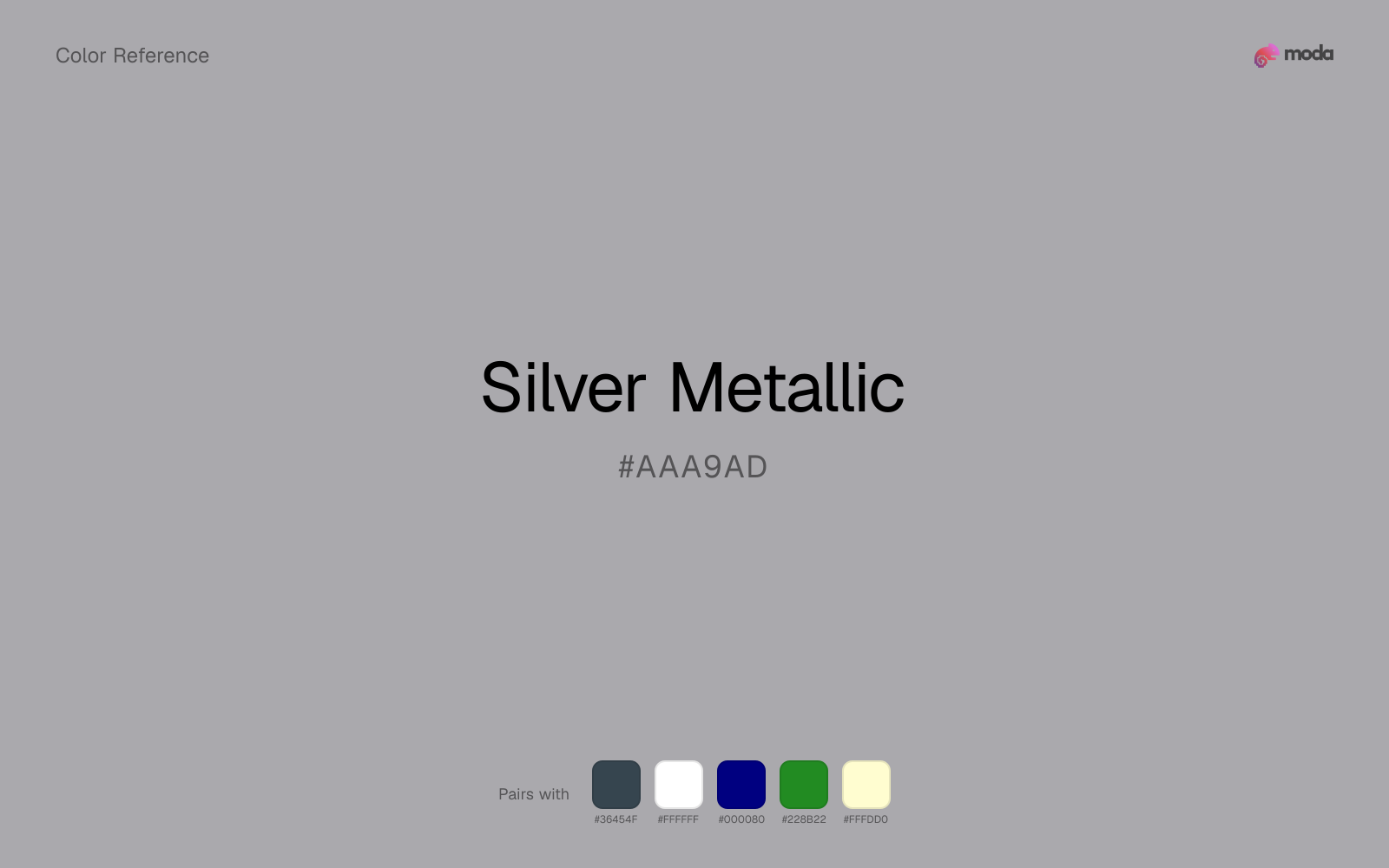
#AAA9AD
RGB
170, 169, 173
HSL
255°, 2%, 67%
HSV
255°, 2%, 68%
Brushed aluminum under office light — cool, rational, faintly industrial. #AAA9AD has shine as suggestion, not spectacle. It pairs naturally with glass, graphite, and crisp typography.
Best for
Mobile app interfaces, onboarding screens, and light-mode UI themes.
Compare with
Accessibility
Check contrast before using silver metallic for text-heavy layouts, especially on low-contrast backgrounds.
How does silver metallic compare to nearby colors?
What is the difference between silver metallic and cool gray?
The main visual split is undertone: Silver Metallic (#AAA9AD) feels more neutral, while Cool Gray (#8C92AC) pulls in a different direction. Silver Metallic and Cool Gray can fill many of the same slots, but one steers the palette toward foil warmth and the other toward brushed gray. Start with silver metallic when the palette wants more foil warmth; switch to cool gray when the better fit is brushed gray.
What color is silver metallic?
Silver metallic finishes are common in electronics casings, automotive trim, and jewelry. In print, silver ink and foil convey modern premium cues.
What is the hex code for silver metallic?
| Format | Value |
|---|---|
| HEX | #AAA9AD |
| RGB | rgb(170, 169, 173) |
| HSL | hsl(255°, 2%, 67%) |
| HSV / HSB | hsv(255°, 2%, 68%) |
| CMYK (approx.) | cmyk(2%, 2%, 0%, 32%) |
Convert Silver Metallic to other color formats
Open the color converter with Silver Metallic (#AAA9AD) prefilled to copy RGB, HSL, HSV, CMYK, or OKLCH values.
Convert Silver Metallic in the color converter →What does silver metallic mean in design?
Silver metallic is often associated with precision, innovation, and sleek utility. Compared with non-metallic silver, it reads as more subdued and steel-like; next to platinum it is typically deeper.
How do I use silver metallic in code?
| CSS (hex) | color: #AAA9AD; |
| CSS (rgb) | color: rgb(170, 169, 173); |
| CSS (hsl) | color: hsl(255, 2%, 67%); |
| RGB % | rgb(67%, 66%, 68%) |
| Tailwind | text-[#AAA9AD] |
| SwiftUI | Color(red: 0.667, green: 0.663, blue: 0.678) |
| UIKit | UIColor(red: 0.667, green: 0.663, blue: 0.678, alpha: 1.0) |
| Android | Color.rgb(170, 169, 173) |
| Compose | Color(0xFFAAA9AD) |
| Web Safe | #999999 |
Is silver metallic accessible?
| Combination | Ratio | AA | AA lg | AAA | AAA lg | UI |
|---|---|---|---|---|---|---|
| AaWhite text on this color | 2.34:1 | ✗ | ✗ | ✗ | ✗ | ✗ |
| AaBlack text on this color | 8.99:1 | ✓ | ✓ | ✓ | ✓ | ✓ |
| AaThis color as text on white | 2.34:1 | ✗ | ✗ | ✗ | ✗ | ✗ |
| AaThis color as text on black | 8.99:1 | ✓ | ✓ | ✓ | ✓ | ✓ |
WCAG 2.1: AA normal ≥ 4.5:1, AA large text ≥ 3:1, AAA normal ≥ 7:1, AAA large ≥ 4.5:1, UI components ≥ 3:1.
How does silver metallic look with color blindness?
Simulated appearance for common types of color vision deficiency. Actual perception varies by individual.
What colors go with silver metallic
Charcoal balances silver metallic by turning the palette into a usable light-dark system rather than a field of soft midtones.
White makes silver metallic feel clearer and more breathable without pulling it warmer or cooler than it already is.
With a lighter silver metallic, navy blue does the structural work that white cannot, so the palette gains hierarchy without falling back to default black.
Forest Green gives silver metallic a second note that is different enough to feel intentional but not so different that the palette loses coherence.
What colors clash with silver metallic
Magenta is so chromatic that silver metallic stops behaving like structure and starts looking like the leftover neutral in somebody else's brighter palette.
Cyan can make silver metallic feel more software-default than designed, especially when the rest of the palette is trying to hold onto material nuance.
Pastel Pink can undercut silver metallic's authority by turning the combination more decorative than decisive.
How should I use silver metallic in design?
- •Silver Metallic works as a primary accent or highlight color — bright enough to draw attention but check contrast carefully if using it for text on white backgrounds.
- •As a neutral, silver metallic pairs with virtually any accent color — add one warm and one cool accent to build visual interest around it.
- •Silver Metallic is a supporting player — effective for borders, dividers, secondary text, and UI scaffolding that needs to stay out of the way.
What are good silver metallic palettes?
Design with silver metallic in Moda
Create a presentation or document using silver metallicas your accent color. Moda's AI applies your color palette automatically.
Create a design with silver metallic →What are the shades and tints of silver metallic?
Shades (darker)
Tints (lighter)
Tones (desaturated)
Similar colors
Cool Gray
Cool Gray does what silver metallic cannot: it nudges the palette toward a cool mood while still behaving like a supporting color.
Slate Gray
Slate Gray stays neutral like silver metallic, yet the lighter-or-darker move changes how much hierarchy the palette gets before any accent color enters.
Dark Gray
Dark Gray lives in almost the same neutral band as silver metallic, but its smoky gray lean can make woods, metals, and off-whites read differently around it.
Silver
Silver lives in almost the same neutral band as silver metallic, but its smoky gray lean can make woods, metals, and off-whites read differently around it.
Pewter
Pewter keeps the neutral character of silver metallic but shifts the value enough to change the job, moving it toward headlines, anchors, and darker sections.
Frequently asked questions
What is the hex code for silver metallic?
The hex code for silver metallic is #AAA9AD. In RGB, that's 170 red, 169 green, and 173 blue. The approximate CMYK equivalent is 2% cyan, 2% magenta, 0% yellow, and 32% key (black).
Is silver metallic a warm or cool color?
Silver Metallic sits close to neutral, which means it can support either warm or cool accents without forcing the palette hard in one direction.
Can silver metallic carry a full palette without feeling too loud?
Silver Metallic is restrained enough to carry larger areas without becoming exhausting. That makes it useful for document systems, presentation themes, and site sections where louder colors would wear out their welcome.
Where does silver metallic work best in a layout?
Silver Metallic is muted and versatile. It can carry a full presentation theme, document system, or website section without overwhelming the layout, and it pairs flexibly with both warm and cool accents.
Is silver metallic accessible?
Silver Metallic works better with dark text than white text. Black text reaches 8.99:1 contrast on the swatch, which makes the color more usable as a background or highlight surface than as a dark panel.
More metallic colors
See all metallic colors →Keep exploring color resources
All color pages
Browse the full library of color references, pairings, and palettes.
Metallic colors
Compare silver metallic with other metallic tones.
Brown colors
Explore nearby color families to build stronger palettes and contrasts.
Neutral colors
Explore nearby color families to build stronger palettes and contrasts.
Orange colors
Explore nearby color families to build stronger palettes and contrasts.
Last updated April 6, 2026
Color values are computed from the listed hex code using standard conversion formulas. RGB, HSL, and HSV are exact screen-ready conversions. CMYK is an approximate on-screen reference, not a press-ready print specification. Pairings, palettes, and use-case guidance are heuristic recommendations derived from color relationships, contrast behavior, and common presentation, document, and UI patterns.