What color is Brass?
HEX
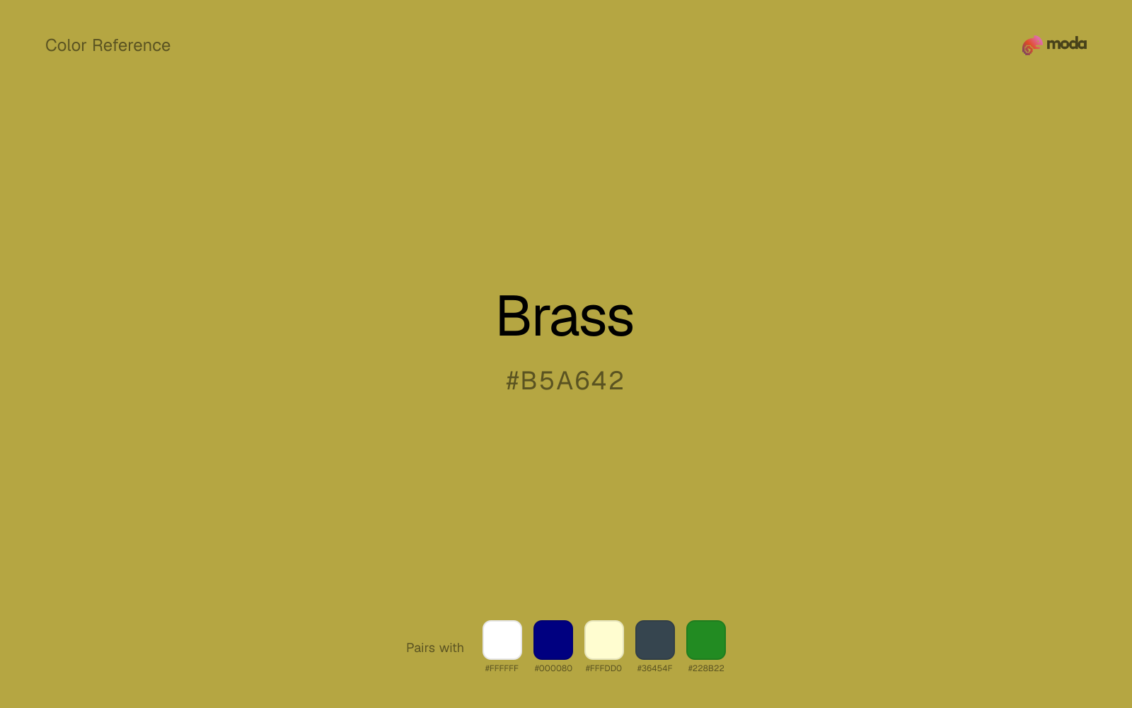
#B5A642
RGB
181, 166, 66
HSL
52°, 47%, 48%
HSV
52°, 64%, 71%
A brighter, brass-section note — more trumpet than cello. #B5A642 has yellow-green alloy warmth that can feel vintage hardware, maritime fittings, or jazz-age glamour. Metallic cheer without the sovereign drama of gold.
Best for
Conference materials, keynote visuals, and thought-leadership content.
Accessibility
Check contrast before using brass for text-heavy layouts, especially on low-contrast backgrounds.
How does brass compare to nearby colors?
What is the difference between brass and goldenrod?
Brass (#B5A642) feels more softened on screen, while Goldenrod (#DAA520) pushes the family in the opposite direction. Brass is easier to live with across large areas, because it carries less chroma pressure than Goldenrod. Use brass for the more restrained version of the idea, and move to goldenrod when the palette needs a brighter front-facing accent.
What color is brass?
Brass (copper-zinc) is widely used in musical instruments, maritime hardware, and decorative metalwork. In interiors, brass fixtures often anchor warm minimalist palettes.
What is the hex code for brass?
| Format | Value |
|---|---|
| HEX | #B5A642 |
| RGB | rgb(181, 166, 66) |
| HSL | hsl(52°, 47%, 48%) |
| HSV / HSB | hsv(52°, 64%, 71%) |
| CMYK (approx.) | cmyk(0%, 8%, 64%, 29%) |
Convert Brass to other color formats
Open the color converter with Brass (#B5A642) prefilled to copy RGB, HSL, HSV, CMYK, or OKLCH values.
Convert Brass in the color converter →What does brass mean in design?
Brass is often associated with hospitality, retro sophistication, and lively warmth. Compared with bronze it reads as lighter and more golden; compared with gold metallic it can feel more everyday.
How do I use brass in code?
| CSS (hex) | color: #B5A642; |
| CSS (rgb) | color: rgb(181, 166, 66); |
| CSS (hsl) | color: hsl(52, 47%, 48%); |
| RGB % | rgb(71%, 65%, 26%) |
| Tailwind | text-[#B5A642] |
| SwiftUI | Color(red: 0.710, green: 0.651, blue: 0.259) |
| UIKit | UIColor(red: 0.710, green: 0.651, blue: 0.259, alpha: 1.0) |
| Android | Color.rgb(181, 166, 66) |
| Compose | Color(0xFFB5A642) |
| Web Safe | #CC9933 |
Is brass accessible?
| Combination | Ratio | AA | AA lg | AAA | AAA lg | UI |
|---|---|---|---|---|---|---|
| AaWhite text on this color | 2.47:1 | ✗ | ✗ | ✗ | ✗ | ✗ |
| AaBlack text on this color | 8.5:1 | ✓ | ✓ | ✓ | ✓ | ✓ |
| AaThis color as text on white | 2.47:1 | ✗ | ✗ | ✗ | ✗ | ✗ |
| AaThis color as text on black | 8.5:1 | ✓ | ✓ | ✓ | ✓ | ✓ |
WCAG 2.1: AA normal ≥ 4.5:1, AA large text ≥ 3:1, AAA normal ≥ 7:1, AAA large ≥ 4.5:1, UI components ≥ 3:1.
How does brass look with color blindness?
Simulated appearance for common types of color vision deficiency. Actual perception varies by individual.
What colors go with brass
White is a reliable partner for brass when the goal is clarity: it adds separation, preserves brightness, and avoids extra mood-shifting.
Because brass already carries warmth, navy blue gives the pair a steadier backbone and keeps it closer to premium editorial work than to one-note seasonal color.
Cream helps brass read warmer, softer, and less screen-hard than it would beside pure white.
Charcoal gives brass a modern dark partner that feels softer and more material than default black.
Forest Green changes how brass comes across: more finance, outdoors, and institutional systems in mood, and less likely to feel isolated or unfinished.
What colors clash with brass
Neon Green changes the meaning of brass too abruptly, replacing the source color's premium packaging and celebratory branding cues with something much louder and less stable.
With brass, magenta introduces a second emotional story instead of reinforcing the first one, so the palette can feel internally split.
Cyan redirects brass toward a more technical, backlit interpretation, which is risky when the goal is warmth, polish, or print-minded editorial work.
With brass, Pastel Pink often steers the system toward nursery or confectionery cues instead of the more grounded mood the source color supports.
How should I use brass in design?
- •Try brass for section backgrounds, card fills, or brand-secondary roles where you want color without overpowering the content.
- •Brass leans warm, so cool counterparts like navy, teal, or slate create the cleanest contrast. For a softer, tonal look, stay within neighboring warm hues and let value differences do the work.
- •Brass works best as a detail accent — foil stamps, rule lines, badge fills, and typographic highlights rather than large surface coverage.
What are good brass palettes?
Noir refinement
Conference materials, keynote visuals, and thought-leadership content.
Design with brass in Moda
Create a presentation or document using brassas your accent color. Moda's AI applies your color palette automatically.
Create a design with brass →What are the shades and tints of brass?
Shades (darker)
Tints (lighter)
Tones (desaturated)
Hue variations
What are the color harmonies for brass?
Harmonies are calculated from the base swatch. When a harmony matches a named color page, it links there; otherwise it appears here as a computed reference swatch.
Similar colors
Gold Metallic
Gold Metallic is nearly adjacent to brass in hue; what separates them is intensity, with gold metallic reading cleaner and more assertive.
Goldenrod
Goldenrod sits close to brass on the wheel, but it carries more pigment pressure, which makes it better for faster emphasis and brighter accent work than for broader coverage and quieter supporting roles.
Bronze
Bronze keeps roughly the same visual weight as brass but changes the undertone story, which is often enough to move a palette from warmer and tactile to cooler and more technical, or the reverse.
Saffron
Saffron is almost the same hue as brass; the real difference is value, with saffron feeling more open and surface-friendly.
Dandelion
Dandelion stays very close to brass in hue, but it lands lighter, which makes it better for backgrounds, tints, and softer supporting areas than for accents, stronger hierarchy, and firmer structure.
Frequently asked questions
What is the hex code for brass?
The hex code for brass is #B5A642. In RGB, that's 181 red, 166 green, and 66 blue. The approximate CMYK equivalent is 0% cyan, 8% magenta, 64% yellow, and 29% key (black).
Is brass a warm or cool color?
Brass reads as warm. It feels most natural with creams, golds, rusts, and other warm accents, while cooler partners like navy or teal create sharper contrast.
Where does brass work best in a layout?
Brass is flexible enough to move between accents, section blocks, and supporting roles depending on the contrast around it. It works best when the rest of the palette gives it a clear job instead of asking it to do everything at once.
How should I use brass in a design?
Brass is versatile enough for headlines, accent bars, buttons, charts, or section backgrounds depending on the contrast around it. It works as either a primary or supporting color in decks, documents, and brand systems.
Can I use brass for text or backgrounds?
Brass works better with dark text than white text. Black text reaches 8.5:1 contrast on the swatch, which makes the color more usable as a background or highlight surface than as a dark panel.
More metallic colors
Keep exploring color resources
All color pages
Browse the full library of color references, pairings, and palettes.
Metallic colors
Compare brass with other metallic tones.
Brown colors
Explore nearby color families to build stronger palettes and contrasts.
Neutral colors
Explore nearby color families to build stronger palettes and contrasts.
Orange colors
Explore nearby color families to build stronger palettes and contrasts.
Last updated April 6, 2026
Color values are computed from the listed hex code using standard conversion formulas. RGB, HSL, and HSV are exact screen-ready conversions. CMYK is an approximate on-screen reference, not a press-ready print specification. Pairings, palettes, and use-case guidance are heuristic recommendations derived from color relationships, contrast behavior, and common presentation, document, and UI patterns.