Midnight Blue meaning and palette guide
HEX
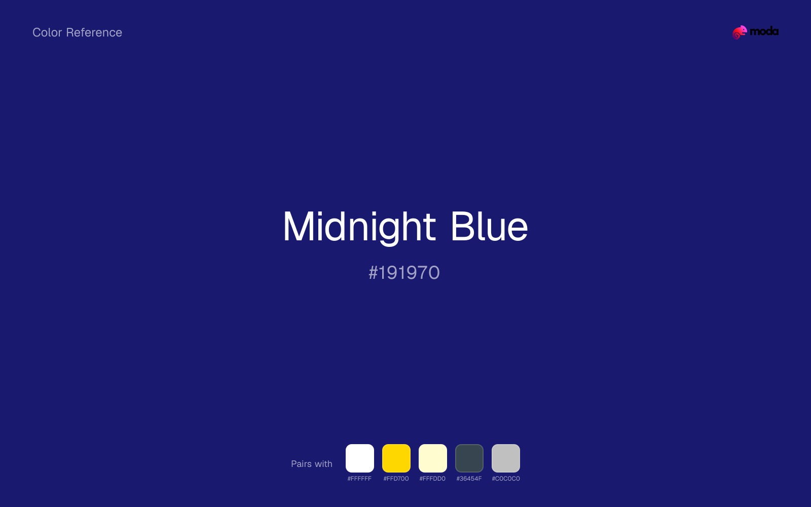
#191970
RGB
25, 25, 112
HSL
240°, 64%, 27%
HSV
240°, 78%, 44%
Near-black with a blue pulse — depth without the harshness of pure black. #191970 reads as night sky and formal wear more than ink. Large areas feel luxurious; small accents feel sharp.
Best for
Conference materials, keynote visuals, and thought-leadership content.
Compare with
Accessibility
White text on midnight blue passes AAA at 14.85:1, so it is safe for dark backgrounds and section headers.
How does midnight blue compare to nearby colors?
What is the difference between midnight blue and cobalt?
Cobalt (#0047AB) carries more pigment punch than Midnight Blue (#191970), so the pair separates by finish as much as hue. Midnight Blue is easier to live with across large areas, because it carries less chroma pressure than Cobalt. Choose midnight blue when the family should feel quieter, more material, or easier to live with across a full layout; use cobalt when you need more punch.
What color is midnight blue?
Used in evening fashion, luxury packaging, automotive interiors, and dark-mode interfaces where designers avoid absolute black for a more comfortable feel.
What is the hex code for midnight blue?
| Format | Value |
|---|---|
| HEX | #191970 |
| RGB | rgb(25, 25, 112) |
| HSL | hsl(240°, 64%, 27%) |
| HSV / HSB | hsv(240°, 78%, 44%) |
| CMYK (approx.) | cmyk(78%, 78%, 0%, 56%) |
Convert Midnight Blue to other color formats
Open the color converter with Midnight Blue (#191970) prefilled to copy RGB, HSL, HSV, CMYK, or OKLCH values.
Convert Midnight Blue in the color converter →What does midnight blue mean in design?
Midnight blue is often associated with mystery, elegance, and nighttime calm. Compared with denim or sapphire, it tends to read as darker, more neutral, and less gemstone-bright.
How do I use midnight blue in code?
| CSS (hex) | color: #191970; |
| CSS (rgb) | color: rgb(25, 25, 112); |
| CSS (hsl) | color: hsl(240, 64%, 27%); |
| RGB % | rgb(10%, 10%, 44%) |
| Tailwind | text-[#191970] |
| SwiftUI | Color(red: 0.098, green: 0.098, blue: 0.439) |
| UIKit | UIColor(red: 0.098, green: 0.098, blue: 0.439, alpha: 1.0) |
| Android | Color.rgb(25, 25, 112) |
| Compose | Color(0xFF191970) |
| Web Safe | #000066 |
Is midnight blue accessible?
| Combination | Ratio | AA | AA lg | AAA | AAA lg | UI |
|---|---|---|---|---|---|---|
| AaWhite text on this color | 14.85:1 | ✓ | ✓ | ✓ | ✓ | ✓ |
| AaBlack text on this color | 1.41:1 | ✗ | ✗ | ✗ | ✗ | ✗ |
| AaThis color as text on white | 14.85:1 | ✓ | ✓ | ✓ | ✓ | ✓ |
| AaThis color as text on black | 1.41:1 | ✗ | ✗ | ✗ | ✗ | ✗ |
WCAG 2.1: AA normal ≥ 4.5:1, AA large text ≥ 3:1, AAA normal ≥ 7:1, AAA large ≥ 4.5:1, UI components ≥ 3:1.
How does midnight blue look with color blindness?
Simulated appearance for common types of color vision deficiency. Actual perception varies by individual.
What colors go with midnight blue
Pairing midnight blue with white preserves readable hierarchy while keeping the swatch itself as the clear focal color.
Gold warms midnight blue enough to keep the palette from feeling chilly or overly technical, while still reading intentional rather than decorative-for-its-own-sake.
Cream makes midnight blue feel more tactile and less clinical, especially in layouts that want a paper or fabric quality.
What colors clash with midnight blue
Neon Green turns midnight blue into something closer to screen glow than surface color, which is a mismatch for most editorial, product, or deck work.
Magenta pushes midnight blue toward a nightclub or cosmetic register that is hard to square with calmer editorial or product work.
Orange changes the context around midnight blue so quickly that the palette can start looking campaign-specific rather than durable.
Pastel Pink can undercut midnight blue's authority by turning the combination more decorative than decisive.
How should I use midnight blue in design?
- •Midnight Blue works well as a dark background with light text, or as a bold accent for headlines and callout bars in presentations and branded materials.
- •Warm touches like gold or coral bring out midnight blue's cooler character by contrast, while staying with cool neighbors creates a calmer, more unified feel.
- •Midnight Blue is a safe choice for corporate decks, SaaS dashboards, and enterprise UI — contexts where trustworthiness is the first design requirement.
What are good midnight blue palettes?
Design with midnight blue in Moda
Create a presentation or document using midnight blueas your accent color. Moda's AI applies your color palette automatically.
Create a design with midnight blue →What are the shades and tints of midnight blue?
Shades (darker)
Tints (lighter)
Tones (desaturated)
Hue variations
What are the color harmonies for midnight blue?
Harmonies are calculated from the base swatch. When a harmony matches a named color page, it links there; otherwise it appears here as a computed reference swatch.
Similar colors
Navy Blue
Navy Blue is nearly adjacent to midnight blue in hue; what separates them is intensity, with navy blue reading cleaner and more assertive.
Cobalt
Cobalt keeps roughly the same visual weight as midnight blue but changes the undertone story, which is often enough to move a palette from warmer and tactile to cooler and more technical, or the reverse.
Indigo
Indigo turns the same general family toward a different energy level, which matters if the palette should feel punchier, dustier, more cosmetic, or more editorial.
Charcoal
Charcoal changes the chroma more than the hue, so the decision is really about temperament: more immediate and screen-bright, or more restrained and spreadable.
Sapphire
Sapphire tracks close to midnight blue in hue, but the value shift changes where each one earns its place: sapphire is easier to use for backgrounds, tints, and softer supporting areas, while midnight blue holds onto accents, stronger hierarchy, and firmer structure.
Frequently asked questions
What is the hex code for midnight blue?
The hex code for midnight blue is #191970. In RGB, that's 25 red, 25 green, and 112 blue. The approximate CMYK equivalent is 78% cyan, 78% magenta, 0% yellow, and 56% key (black).
Is midnight blue a warm or cool color?
Midnight Blue falls on the cool side of the palette, so warm companions create the clearest contrast while other cool tones keep the system more restrained.
Is midnight blue better for accents, structure, or surfaces?
Midnight Blue sits in the usable middle: strong enough to anchor a section or call attention to a key moment, but calm enough to support a broader system when the surrounding values are well managed.
Where does midnight blue work best in a layout?
Midnight Blue has enough depth to anchor a layout while still reading as a color, which makes it useful for dark section blocks, headlines, and heavier accents.
Is midnight blue accessible?
Midnight Blue is strong enough for white text at 14.85:1 contrast, so it can handle dark panels, tags, and section headers without much trouble. As text on white, though, it is usually better reserved for larger headings or short accents than for long paragraphs.
More blue colors
Keep exploring color resources
All color pages
Browse the full library of color references, pairings, and palettes.
Blue colors
Compare midnight blue with other blue tones.
Green colors
Explore nearby color families to build stronger palettes and contrasts.
Neutral colors
Explore nearby color families to build stronger palettes and contrasts.
Purple colors
Explore nearby color families to build stronger palettes and contrasts.
Last updated April 6, 2026
Color values are computed from the listed hex code using standard conversion formulas. RGB, HSL, and HSV are exact screen-ready conversions. CMYK is an approximate on-screen reference, not a press-ready print specification. Pairings, palettes, and use-case guidance are heuristic recommendations derived from color relationships, contrast behavior, and common presentation, document, and UI patterns.