Using Dark Red in design
HEX
#8B0000
RGB
139, 0, 0
HSL
0°, 100%, 27%
HSV
0°, 100%, 55%
Dark red is red pushed toward night — still clearly red, but heavy enough to behave like a near-neutral anchor. #8B0000 is ideal for typography accents, leather-like UI chrome, and cinematic key art where you need drama without neon. Its job is weight, not sparkle.
Best for
Corporate branding, executive reports, and enterprise-level web design.
Accessibility
White text on dark red passes AAA at 10.01:1, so it is safe for dark backgrounds and section headers.
How does dark red compare to nearby colors?
What is the difference between dark red and oxblood?
Dark Red (#8B0000) and Oxblood (#4A0404) are close enough that the split is more about finish than headline contrast: Dark Red feels more deep value, while Oxblood reads more dark-anchor value. Dark Red is easier to use across cards, charts, and accents because it is not locked into the dark-anchor job that Oxblood handles. Begin with dark red when the family needs its current undertone and surface character; keep oxblood for the nearby alternative that shifts the mood without leaving the same hue neighborhood.
What color is dark red?
As a CSS/HTML named color, "darkred" is part of the standard web palette developers have used for decades. The same general descriptor appears across paint and fashion as a deep, muted red.
What is the hex code for dark red?
| Format | Value |
|---|---|
| HEX | #8B0000 |
| RGB | rgb(139, 0, 0) |
| HSL | hsl(0°, 100%, 27%) |
| HSV / HSB | hsv(0°, 100%, 55%) |
| CMYK (approx.) | cmyk(0%, 100%, 100%, 45%) |
Convert Dark Red to other color formats
Open the color converter with Dark Red (#8B0000) prefilled to copy RGB, HSL, HSV, CMYK, or OKLCH values.
Convert Dark Red in the color converter →What does dark red mean in design?
Very dark reds are often associated with seriousness, luxury, and somber moods. Dark red tends to read more severe and enveloping than cardinal or fire-engine red, and less earthy than indian red. Large dark fields usually need careful contrast so details do not disappear.
How do I use dark red in code?
| CSS (hex) | color: #8B0000; |
| CSS (rgb) | color: rgb(139, 0, 0); |
| CSS (hsl) | color: hsl(0, 100%, 27%); |
| RGB % | rgb(55%, 0%, 0%) |
| Tailwind | text-[#8B0000] |
| SwiftUI | Color(red: 0.545, green: 0.000, blue: 0.000) |
| UIKit | UIColor(red: 0.545, green: 0.000, blue: 0.000, alpha: 1.0) |
| Android | Color.rgb(139, 0, 0) |
| Compose | Color(0xFF8B0000) |
| Web Safe | #990000 |
Is dark red accessible?
| Combination | Ratio | AA | AA lg | AAA | AAA lg | UI |
|---|---|---|---|---|---|---|
| AaWhite text on this color | 10.01:1 | ✓ | ✓ | ✓ | ✓ | ✓ |
| AaBlack text on this color | 2.1:1 | ✗ | ✗ | ✗ | ✗ | ✗ |
| AaThis color as text on white | 10.01:1 | ✓ | ✓ | ✓ | ✓ | ✓ |
| AaThis color as text on black | 2.1:1 | ✗ | ✗ | ✗ | ✗ | ✗ |
WCAG 2.1: AA normal ≥ 4.5:1, AA large text ≥ 3:1, AAA normal ≥ 7:1, AAA large ≥ 4.5:1, UI components ≥ 3:1.
How does dark red look with color blindness?
Simulated appearance for common types of color vision deficiency. Actual perception varies by individual.
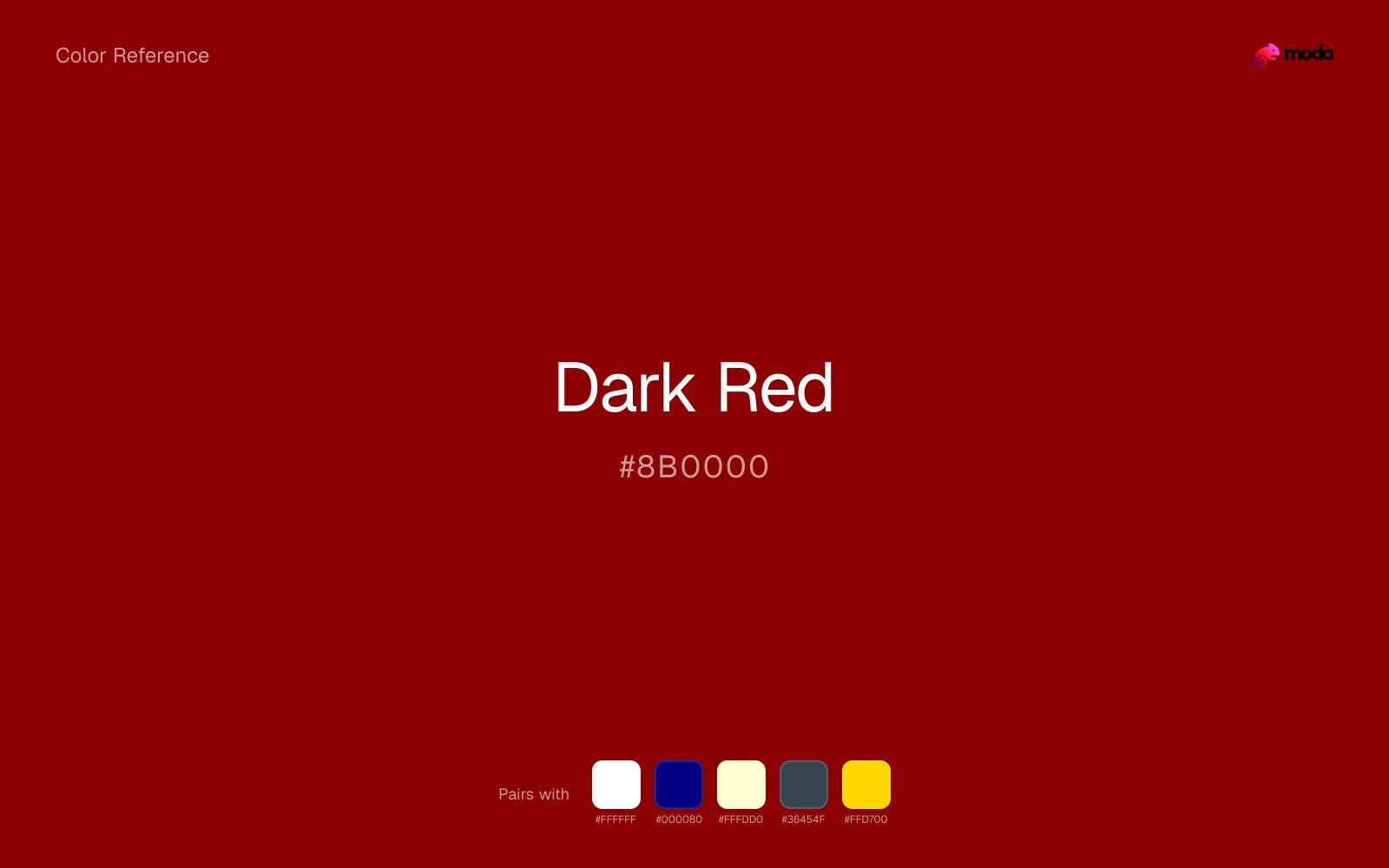
What colors go with dark red
White helps dark red stay legible in charts, labels, and UI states where a muddier light neutral would blur the edges.
Beside dark red, navy blue supplies structure that keeps the palette from drifting into event-poster or promotional red territory.
Cream takes the hard digital edge off dark red and makes the color feel more printed, paper-backed, and approachable.
What colors clash with dark red
Neon Green competes with dark red so aggressively that the palette never really settles into a clear primary-secondary relationship.
Magenta remaps dark red too aggressively, dragging it away from premium retail and sport and into a brighter, more performative palette.
Cyan redirects dark red toward a more technical, backlit interpretation, which is risky when the goal is warmth, polish, or print-minded editorial work.
With dark red, Pastel Pink often steers the system toward nursery or confectionery cues instead of the more grounded mood the source color supports.
How should I use dark red in design?
- •Dark Red works well as a dark background with light text, or as a bold accent for headlines and callout bars in presentations and branded materials.
- •Pair dark red with cool accents (navy, sage, steel blue) for sharp contrast, or keep it with other warm tones (cream, gold, tan) for a cohesive, editorial feel.
- •Vivid colors like dark red work best as punctuation in a layout: CTAs, key metrics, or a single hero element. Surrounding neutrals keep it from fatiguing the viewer.
What are good dark red palettes?
Noir refinement
Corporate branding, executive reports, and enterprise-level web design.
Design with dark red in Moda
Create a presentation or document using dark redas your accent color. Moda's AI applies your color palette automatically.
Create a design with dark red →What are the shades and tints of dark red?
Shades (darker)
Tints (lighter)
Tones (desaturated)
Hue variations
What are the color harmonies for dark red?
Harmonies are calculated from the base swatch. When a harmony matches a named color page, it links there; otherwise it appears here as a computed reference swatch.
Similar colors
Maroon
Maroon lives in the same neighborhood as dark red, but the finish shift is enough to make one feel better for premium retail and sport and the other for a different visual context.
Carmine
Carmine is near enough to dark red to swap into the same palette, yet the undertone shift still decides whether the family reads warmer or cooler overall.
Burgundy
Burgundy lives in the same neighborhood as dark red, but the finish shift is enough to make one feel better for premium retail and sport and the other for a different visual context.
Oxblood
Oxblood stays in the same color family as dark red, but the change in value moves it into different layout jobs, especially once backgrounds, charts, or section dividers enter the system.
Wine
Wine is nearly adjacent to dark red in hue; what separates them is intensity, with wine reading dustier and easier to extend across a layout.
Frequently asked questions
What is the hex code for dark red?
The hex code for dark red is #8B0000. In RGB, that's 139 red, 0 green, and 0 blue. The approximate CMYK equivalent is 0% cyan, 100% magenta, 100% yellow, and 45% key (black).
Is dark red a warm or cool color?
Dark Red reads as warm. It feels most natural with creams, golds, rusts, and other warm accents, while cooler partners like navy or teal create sharper contrast.
Is dark red better as an accent or a full-palette color?
Dark Red is usually best when it leads in short bursts rather than covering everything. It can headline a palette, but most layouts work better when the color handles accents, highlights, or one main hero role instead of every surface.
How should I use dark red in a design?
Dark Red works well as a dark background with light text, or as a bold accent for headlines, callout bars, and key visuals. It adds weight and authority without the starkness of pure black.
Can I use dark red for text or backgrounds?
Dark Red is strong enough for white text at 10.01:1 contrast, so it can handle dark panels, tags, and section headers without much trouble. As text on white, though, it is usually better reserved for larger headings or short accents than for long paragraphs.
More red colors
Keep exploring color resources
All color pages
Browse the full library of color references, pairings, and palettes.
Red colors
Compare dark red with other red tones.
Brown colors
Explore nearby color families to build stronger palettes and contrasts.
Neutral colors
Explore nearby color families to build stronger palettes and contrasts.
Orange colors
Explore nearby color families to build stronger palettes and contrasts.
Last updated April 6, 2026
Color values are computed from the listed hex code using standard conversion formulas. RGB, HSL, and HSV are exact screen-ready conversions. CMYK is an approximate on-screen reference, not a press-ready print specification. Pairings, palettes, and use-case guidance are heuristic recommendations derived from color relationships, contrast behavior, and common presentation, document, and UI patterns.