Jade color guide
HEX
#00A86B
RGB
0, 168, 107
HSL
158°, 100%, 33%
HSV
158°, 100%, 66%
Jade carries the cool confidence of carved stone — balanced between emerald drama and teal restraint. #00A86B is vivid enough for luxury cues yet grounded enough for wellness and global design palettes. It reads expensive without defaulting to black-and-gold formulas.
Best for
Corporate branding, executive reports, and enterprise-level web design.
Accessibility
Check contrast before using jade for text-heavy layouts, especially on low-contrast backgrounds.
How does jade compare to nearby colors?
What is the difference between jade and pine?
Jade (#00A86B) and Pine (#01796F) are close enough that the split is more about finish than headline contrast: Jade feels more lighter handling, while Pine reads more darker handling. Jade is easier to use across cards, charts, and accents because it is not locked into the dark-anchor job that Pine handles. Begin with jade when the family needs its current undertone and surface character; keep pine for the nearby alternative that shifts the mood without leaving the same hue neighborhood.
What color is jade?
"Jade" references the minerals jadeite and nephrite and appears in jewelry marketing, East Asian design language, and spa branding.
What is the hex code for jade?
| Format | Value |
|---|---|
| HEX | #00A86B |
| RGB | rgb(0, 168, 107) |
| HSL | hsl(158°, 100%, 33%) |
| HSV / HSB | hsv(158°, 100%, 66%) |
| CMYK (approx.) | cmyk(100%, 0%, 36%, 34%) |
Convert Jade to other color formats
Open the color converter with Jade (#00A86B) prefilled to copy RGB, HSL, HSV, CMYK, or OKLCH values.
Convert Jade in the color converter →What does jade mean in design?
Jade is often associated with harmony, prosperity, and refined vitality across many cultural contexts. Next to pine it tends to read as brighter and less deep-sea; beside seafoam it usually feels richer, more saturated, and less airy.
How do I use jade in code?
| CSS (hex) | color: #00A86B; |
| CSS (rgb) | color: rgb(0, 168, 107); |
| CSS (hsl) | color: hsl(158, 100%, 33%); |
| RGB % | rgb(0%, 66%, 42%) |
| Tailwind | text-[#00A86B] |
| SwiftUI | Color(red: 0.000, green: 0.659, blue: 0.420) |
| UIKit | UIColor(red: 0.000, green: 0.659, blue: 0.420, alpha: 1.0) |
| Android | Color.rgb(0, 168, 107) |
| Compose | Color(0xFF00A86B) |
| Web Safe | #009966 |
Is jade accessible?
| Combination | Ratio | AA | AA lg | AAA | AAA lg | UI |
|---|---|---|---|---|---|---|
| AaWhite text on this color | 3.08:1 | ✗ | ✓ | ✗ | ✗ | ✓ |
| AaBlack text on this color | 6.81:1 | ✓ | ✓ | ✗ | ✓ | ✓ |
| AaThis color as text on white | 3.08:1 | ✗ | ✓ | ✗ | ✗ | ✓ |
| AaThis color as text on black | 6.81:1 | ✓ | ✓ | ✗ | ✓ | ✓ |
WCAG 2.1: AA normal ≥ 4.5:1, AA large text ≥ 3:1, AAA normal ≥ 7:1, AAA large ≥ 4.5:1, UI components ≥ 3:1.
How does jade look with color blindness?
Simulated appearance for common types of color vision deficiency. Actual perception varies by individual.
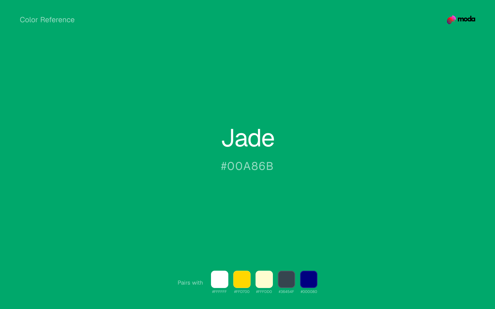
What colors go with jade
White sharpens jade without cooling it off, which is useful when you need a clean interface or slide layout around the color.
With a cooler color like jade, gold adds richness and turns the system toward premium packaging, hospitality, or ceremonial branding.
Cream takes the hard digital edge off jade and makes the color feel more printed, paper-backed, and approachable.
What colors clash with jade
Neon Green changes the meaning of jade too abruptly, replacing the source color's finance, outdoors, and institutional systems cues with something much louder and less stable.
Magenta remaps jade too aggressively, dragging it away from finance, outdoors, and institutional systems and into a brighter, more performative palette.
Orange lands abruptly next to jade and can make the palette feel more promo-coded or team-coded than intended.
Pastel Pink can undercut jade's authority by turning the combination more decorative than decisive.
How should I use jade in design?
- •Use jade for headlines, sidebar accents, and key data points where you need strong presence without going full dark-mode.
- •Jade leans cool, so warm accents like gold, coral, or rust add the most energy. For a calm, professional palette, stay with other cool tones and use value contrast instead.
- •Jade's high saturation makes it most effective in small doses — buttons, chart highlights, notification badges, and social media accents.
What are good jade palettes?
Dark precision
Corporate branding, executive reports, and enterprise-level web design.
Design with jade in Moda
Create a presentation or document using jadeas your accent color. Moda's AI applies your color palette automatically.
Create a design with jade →What are the shades and tints of jade?
Shades (darker)
Tints (lighter)
Tones (desaturated)
Hue variations
What are the color harmonies for jade?
Harmonies are calculated from the base swatch. When a harmony matches a named color page, it links there; otherwise it appears here as a computed reference swatch.
Similar colors
Pine
Pine is almost the same hue as jade; the real difference is value, with pine feeling more grounded and anchor-ready.
Teal
Teal is useful when jade is the right weight but the wrong mood: the swap changes temperature and finish more than contrast.
Spring Green
Spring Green stays in the same color family as jade, but the change in value moves it into different layout jobs, especially once backgrounds, charts, or section dividers enter the system.
Cerulean
Cerulean is a nearby alternative to jade when the palette needs a different undertone or material cue more than a dramatic contrast change.
Emerald
Emerald tracks close to jade in hue, but the value shift changes where each one earns its place: emerald is easier to use for backgrounds, tints, and softer supporting areas, while jade holds onto accents, stronger hierarchy, and firmer structure.
Frequently asked questions
What is the hex code for jade?
The hex code for jade is #00A86B. In RGB, that's 0 red, 168 green, and 107 blue. The approximate CMYK equivalent is 100% cyan, 0% magenta, 36% yellow, and 34% key (black).
Is jade a warm or cool color?
Jade falls on the cool side of the palette, so warm companions create the clearest contrast while other cool tones keep the system more restrained.
Should jade lead the palette or stay in supporting roles?
Jade has enough chroma to take the lead, but it usually performs best when the surrounding system stays quieter. Treat it as the voice of emphasis, not the answer to every layout need.
Where does jade work best in a layout?
Jade carries a lot of chroma, so it is usually strongest as punctuation rather than wallpaper. Use it for focal accents and let low-saturation surfaces do the balancing.
Is jade accessible?
Jade works better with dark text than white text. Black text reaches 6.81:1 contrast on the swatch, which makes the color more usable as a background or highlight surface than as a dark panel.
More green colors
Keep exploring color resources
All color pages
Browse the full library of color references, pairings, and palettes.
Green colors
Compare jade with other green tones.
Blue colors
Explore nearby color families to build stronger palettes and contrasts.
Brown colors
Explore nearby color families to build stronger palettes and contrasts.
Neutral colors
Explore nearby color families to build stronger palettes and contrasts.
Last updated April 6, 2026
Color values are computed from the listed hex code using standard conversion formulas. RGB, HSL, and HSV are exact screen-ready conversions. CMYK is an approximate on-screen reference, not a press-ready print specification. Pairings, palettes, and use-case guidance are heuristic recommendations derived from color relationships, contrast behavior, and common presentation, document, and UI patterns.