Pine palettes and pairings
HEX
#01796F
RGB
1, 121, 111
HSL
175°, 98%, 24%
HSV
175°, 99%, 47%
Pine leans into evergreen shadow with a teal undertow — deep, resinous, and slightly cold. #01796F reads like conifers against northern water: dark green with a blue pull that feels crisp rather than muddy. It suits premium outdoors and winter holiday palettes alike.
Best for
Conference materials, keynote visuals, and thought-leadership content.
Accessibility
Pine text on white passes AA at 5.3:1, which makes it usable for headings and short labels.
How does pine compare to nearby colors?
What is the difference between pine and jade?
The visible difference between Pine (#01796F) and Jade (#00A86B) is subtle, but it still nudges the family from darker handling toward lighter handling. Pine has enough shadow to function like the structural base of a palette, while Jade stays better suited to lighter-facing uses. Start with pine when the palette wants more darker handling; switch to jade when the better fit is lighter handling.
What color is pine?
Paint and holiday decor markets use "pine" for blue-leaning deep greens suggesting needles and winter forests. It overlaps with naming for teal and petrol tones in fashion.
What is the hex code for pine?
| Format | Value |
|---|---|
| HEX | #01796F |
| RGB | rgb(1, 121, 111) |
| HSL | hsl(175°, 98%, 24%) |
| HSV / HSB | hsv(175°, 99%, 47%) |
| CMYK (approx.) | cmyk(99%, 0%, 8%, 53%) |
Convert Pine to other color formats
Open the color converter with Pine (#01796F) prefilled to copy RGB, HSL, HSV, CMYK, or OKLCH values.
Convert Pine in the color converter →What does pine mean in design?
Pine is often associated with winter calm, cleanliness, and elevated naturalism. Compared with jade it tends to read as deeper and more shadowed; beside dark green it usually feels cooler and more aquatic.
How do I use pine in code?
| CSS (hex) | color: #01796F; |
| CSS (rgb) | color: rgb(1, 121, 111); |
| CSS (hsl) | color: hsl(175, 98%, 24%); |
| RGB % | rgb(0%, 47%, 44%) |
| Tailwind | text-[#01796F] |
| SwiftUI | Color(red: 0.004, green: 0.475, blue: 0.435) |
| UIKit | UIColor(red: 0.004, green: 0.475, blue: 0.435, alpha: 1.0) |
| Android | Color.rgb(1, 121, 111) |
| Compose | Color(0xFF01796F) |
| Web Safe | #006666 |
Is pine accessible?
| Combination | Ratio | AA | AA lg | AAA | AAA lg | UI |
|---|---|---|---|---|---|---|
| AaWhite text on this color | 5.3:1 | ✓ | ✓ | ✗ | ✓ | ✓ |
| AaBlack text on this color | 3.97:1 | ✗ | ✓ | ✗ | ✗ | ✓ |
| AaThis color as text on white | 5.3:1 | ✓ | ✓ | ✗ | ✓ | ✓ |
| AaThis color as text on black | 3.97:1 | ✗ | ✓ | ✗ | ✗ | ✓ |
WCAG 2.1: AA normal ≥ 4.5:1, AA large text ≥ 3:1, AAA normal ≥ 7:1, AAA large ≥ 4.5:1, UI components ≥ 3:1.
How does pine look with color blindness?
Simulated appearance for common types of color vision deficiency. Actual perception varies by individual.
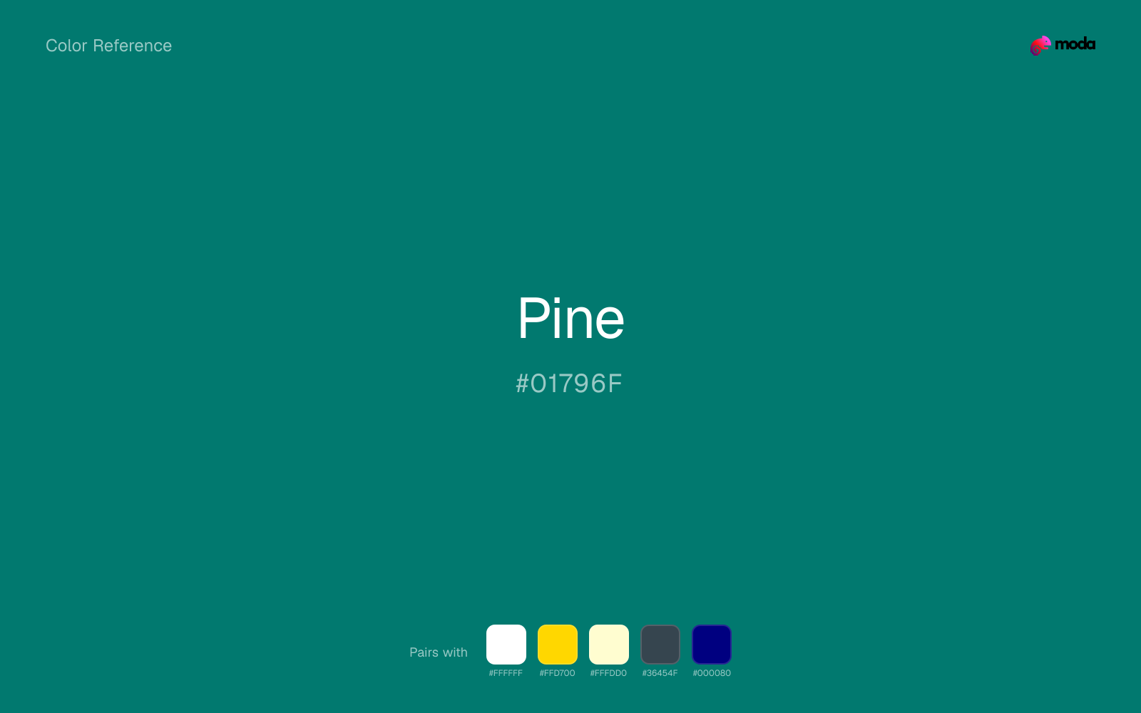
What colors go with pine
White gives pine the clean edge contrast it needs, so dark panels, labels, and type stay readable instead of sinking into the color.
Gold warms pine enough to keep the palette from feeling chilly or overly technical, while still reading intentional rather than decorative-for-its-own-sake.
With a vivid pine, cream is gentler than white, so the palette keeps warmth and avoids looking overlit.
What colors clash with pine
With pine, Neon Green pushes the work toward novelty or screen-effect territory faster than most brand or editorial systems can tolerate.
With pine, magenta introduces a second emotional story instead of reinforcing the first one, so the palette can feel internally split.
Orange lands abruptly next to pine and can make the palette feel more promo-coded or team-coded than intended.
Pastel Pink can make pine feel softer and sweeter than intended, which weakens palettes that rely on gravity or structure.
How should I use pine in design?
- •Pine works well as a dark background with light text, or as a bold accent for headlines and callout bars in presentations and branded materials.
- •Warm touches like gold or coral bring out pine's cooler character by contrast, while staying with cool neighbors creates a calmer, more unified feel.
- •Pine's depth makes it effective for premium packaging, dark-mode interfaces, and editorial layouts that need gravitas without defaulting to black.
What are good pine palettes?
Carbon elegance
Conference materials, keynote visuals, and thought-leadership content.
Design with pine in Moda
Create a presentation or document using pineas your accent color. Moda's AI applies your color palette automatically.
Create a design with pine →What are the shades and tints of pine?
Shades (darker)
Tints (lighter)
Tones (desaturated)
Hue variations
What are the color harmonies for pine?
Harmonies are calculated from the base swatch. When a harmony matches a named color page, it links there; otherwise it appears here as a computed reference swatch.
Similar colors
Teal
Teal sits close to pine in hue, but its aqua-blue cast changes the mood of the palette even when the contrast shift is small.
Jade
Jade is almost the same hue as pine; the real difference is value, with jade feeling more open and surface-friendly.
Cerulean
Cerulean occupies a similar depth to pine, though it pushes the family toward a more cool reading and a different material feel.
Ocean Blue
Ocean Blue stays in the same color family as pine, but the change in value moves it into different layout jobs, especially once backgrounds, charts, or section dividers enter the system.
Cobalt
Cobalt is a nearby alternative to pine when the palette needs a different undertone or material cue more than a dramatic contrast change.
Frequently asked questions
What is the hex code for pine?
The hex code for pine is #01796F. In RGB, that's 1 red, 121 green, and 111 blue. The approximate CMYK equivalent is 99% cyan, 0% magenta, 8% yellow, and 53% key (black).
Is pine a warm or cool color?
Pine falls on the cool side of the palette, so warm companions create the clearest contrast while other cool tones keep the system more restrained.
Should pine lead the palette or stay in supporting roles?
Pine has enough chroma to take the lead, but it usually performs best when the surrounding system stays quieter. Treat it as the voice of emphasis, not the answer to every layout need.
Where does pine work best in a layout?
Pine has enough depth to anchor a layout while still reading as a color, which makes it useful for dark section blocks, headlines, and heavier accents.
Is pine accessible?
Pine can work as text on white at 5.3:1 contrast, but it is usually safest in headings, labels, and accent moments rather than long body copy.
More green colors
Keep exploring color resources
All color pages
Browse the full library of color references, pairings, and palettes.
Green colors
Compare pine with other green tones.
Blue colors
Explore nearby color families to build stronger palettes and contrasts.
Brown colors
Explore nearby color families to build stronger palettes and contrasts.
Neutral colors
Explore nearby color families to build stronger palettes and contrasts.
Last updated April 6, 2026
Color values are computed from the listed hex code using standard conversion formulas. RGB, HSL, and HSV are exact screen-ready conversions. CMYK is an approximate on-screen reference, not a press-ready print specification. Pairings, palettes, and use-case guidance are heuristic recommendations derived from color relationships, contrast behavior, and common presentation, document, and UI patterns.